Getting Started with Fiddler’s Charts UI
The Chart UI on Fiddler AI’s platform is designed to help you effectively monitor and analyze model performance metrics. Navigating to the Charts tab in the navigation bar allows you to easily access the tools needed to visualize key data and track your LLM and ML models’ performance. Choose to open a previously saved chart for ongoing analysis or create a new one tailored to specific metrics, such as response faithfulness, jailbreak attempts, data drift, and more.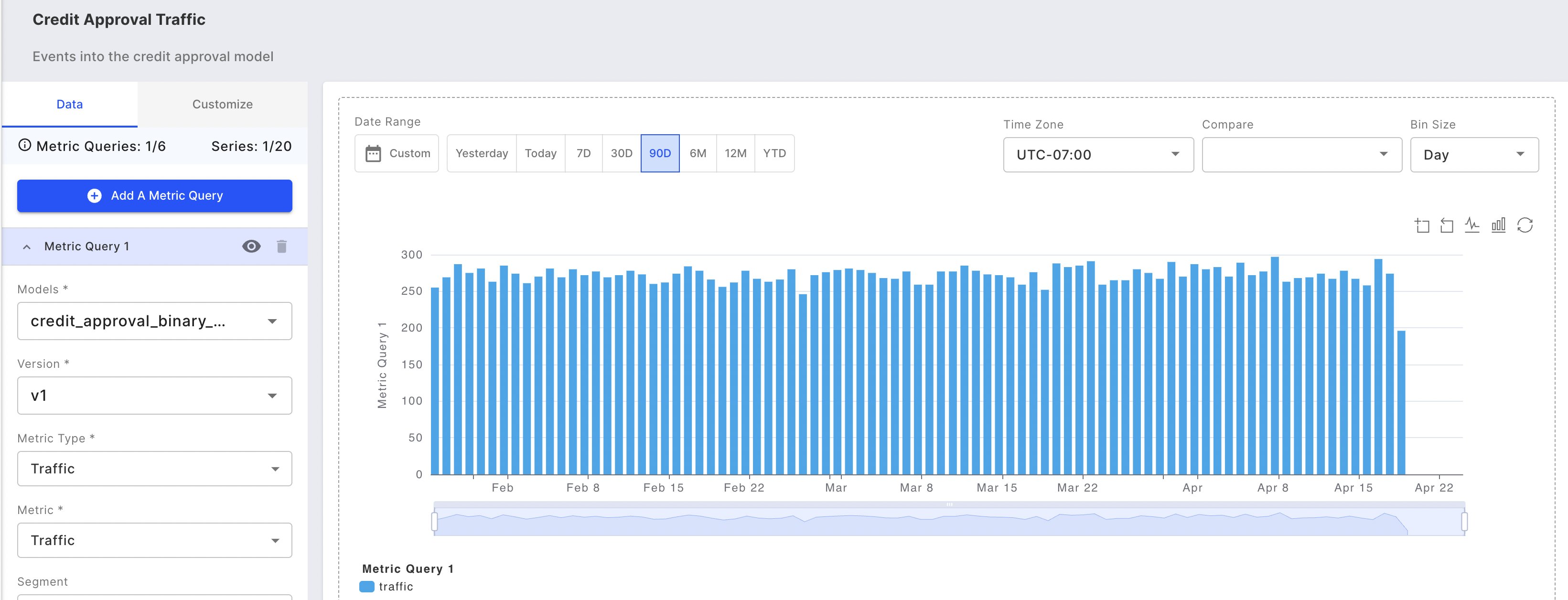
Supported Metric Types
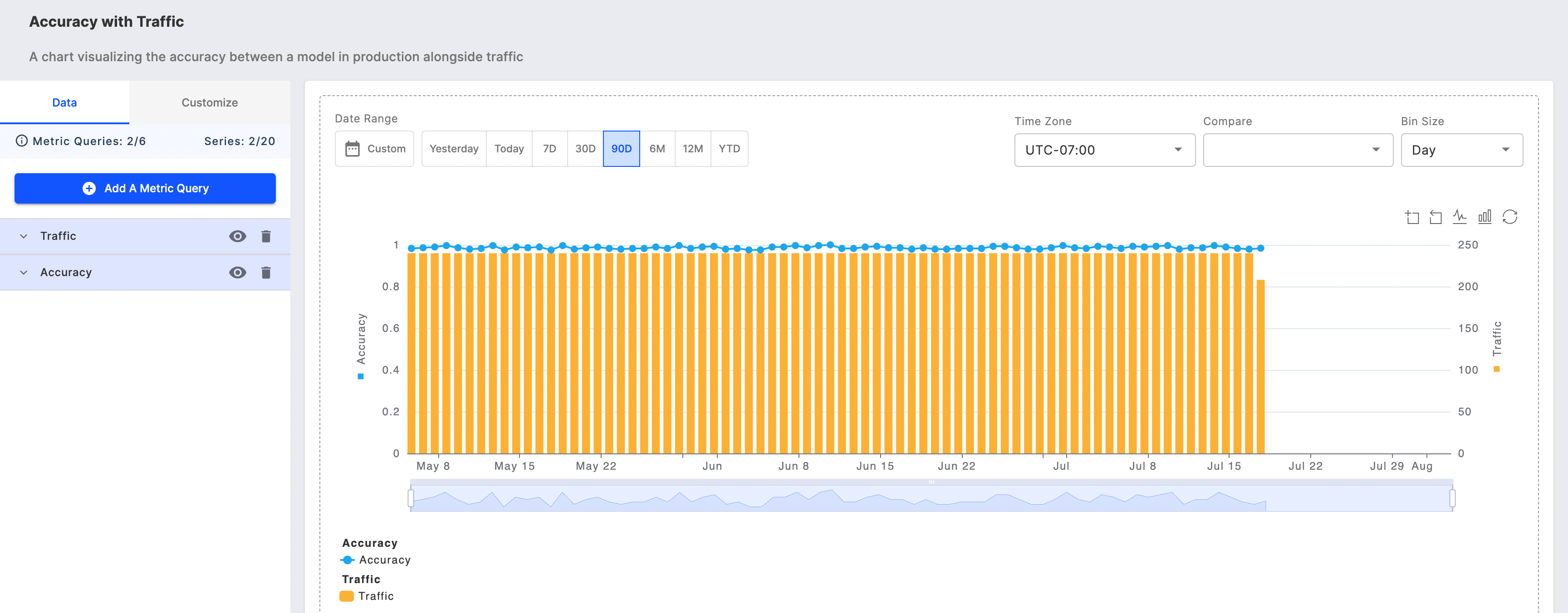
Monitoring charts enable you to plot any combination of the following metric types for a given model:- Traffic
- Model traffic volume over time provides insights into system usage patterns and overall operational health.
- Statistics
- Aggregated metrics that monitor trends and changes in your model’s data columns
- Data Drift
- Data drift occurs when production data differs significantly from training data, potentially degrading model performance and accuracy.
- Data Integrity
- Monitors three critical data integrity issues: missing values, incorrect data types, and out-of-range values that violate model input requirements.
- Performance
- Model performance measures how accurately your model accomplishes its intended task, directly impacting business outcomes and decision quality.
- Custom Metrics
- Build tailored monitoring metrics that align with your specific business rules and success criteria using custom formulas.
What Are the Key Features and Functions of the Monitoring Chart UI?
Multiple Charting Options
You can plot up to 20 columns and 6 metric queries for a model enabling you to easily perform model-to-model comparisons and plot multiple metrics in a single chart view.Embedded Root Cause Analytics
Root cause analysis information covers data drift and data integrity, and performance analytics charts for binary classification, multiclass classification, and regression models.Download Your Raw Data for Further Analysis
You can easily download the raw chart data to CSV or parquet files. This feature allows you to analyze your data further.How to Create a New Monitoring Chart
To create a new monitoring chart, click on the Add Chart button on the Charts page. Search for and select the project to create the chart, and press Add Chart.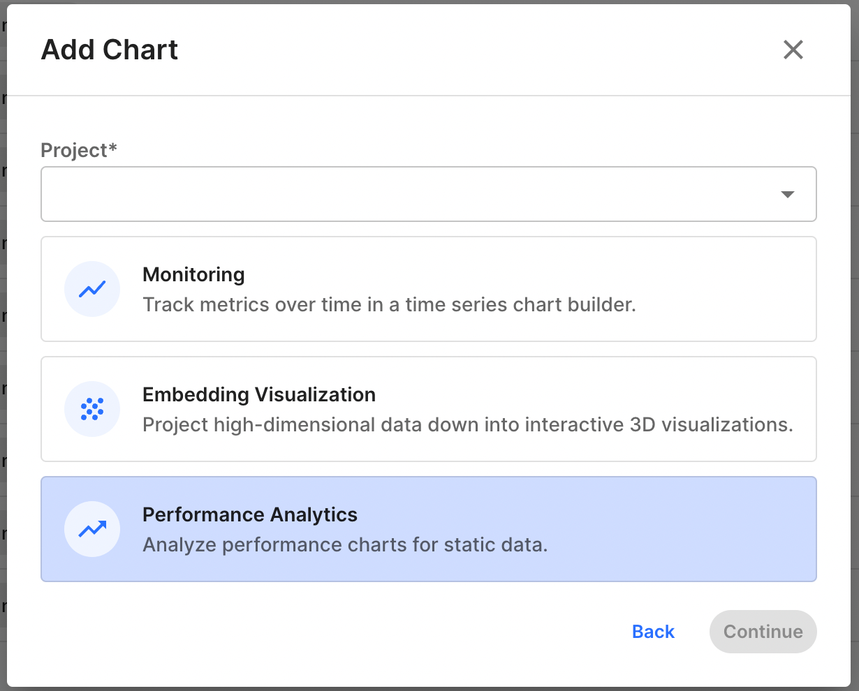
Save and Share Your Monitoring Chart
Save your chart by clicking the Save button in the chart studio’s top right corner. You can then share your chart by copying its link and sending it to other users who have access to the project.Undo and Redo Actions
Easily control the following actions with the undo and redo buttons:- Metric query selection
- Time range selections
- Bin size selections
Exploring Chart Metric Queries & Filters
Creating and Managing Metric Queries
Start building your monitoring chart by creating a metric query. First, select a model from your project to analyze. Then, specify which metrics and columns you want to visualize. Note that you can only select models that exist within your current project. Select the type of metric you want to monitor: Performance, Data Drift, Data Integrity, Statistic, Traffic, or Custom Metric. Then choose specific metrics within that category. For instance, if you’re monitoring a binary classification model, you might select Performance metrics and track accuracy over time.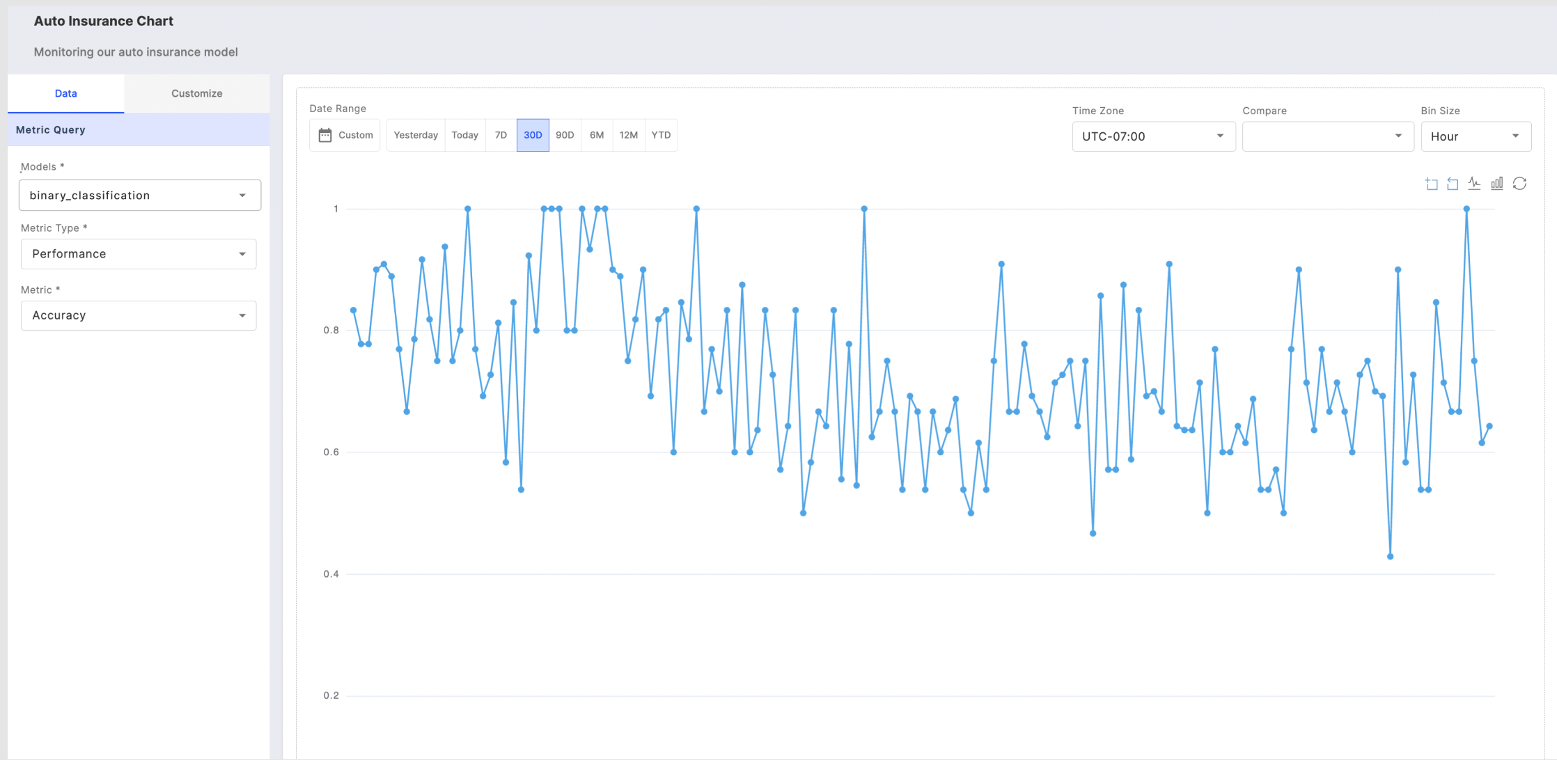
Customizing Columns for Monitoring Charts
If you choose to chart data drift or data integrity, you can choose to plot up to 20 different columns from the following column categories: inputs, outputs, targets, metadata, and custom features.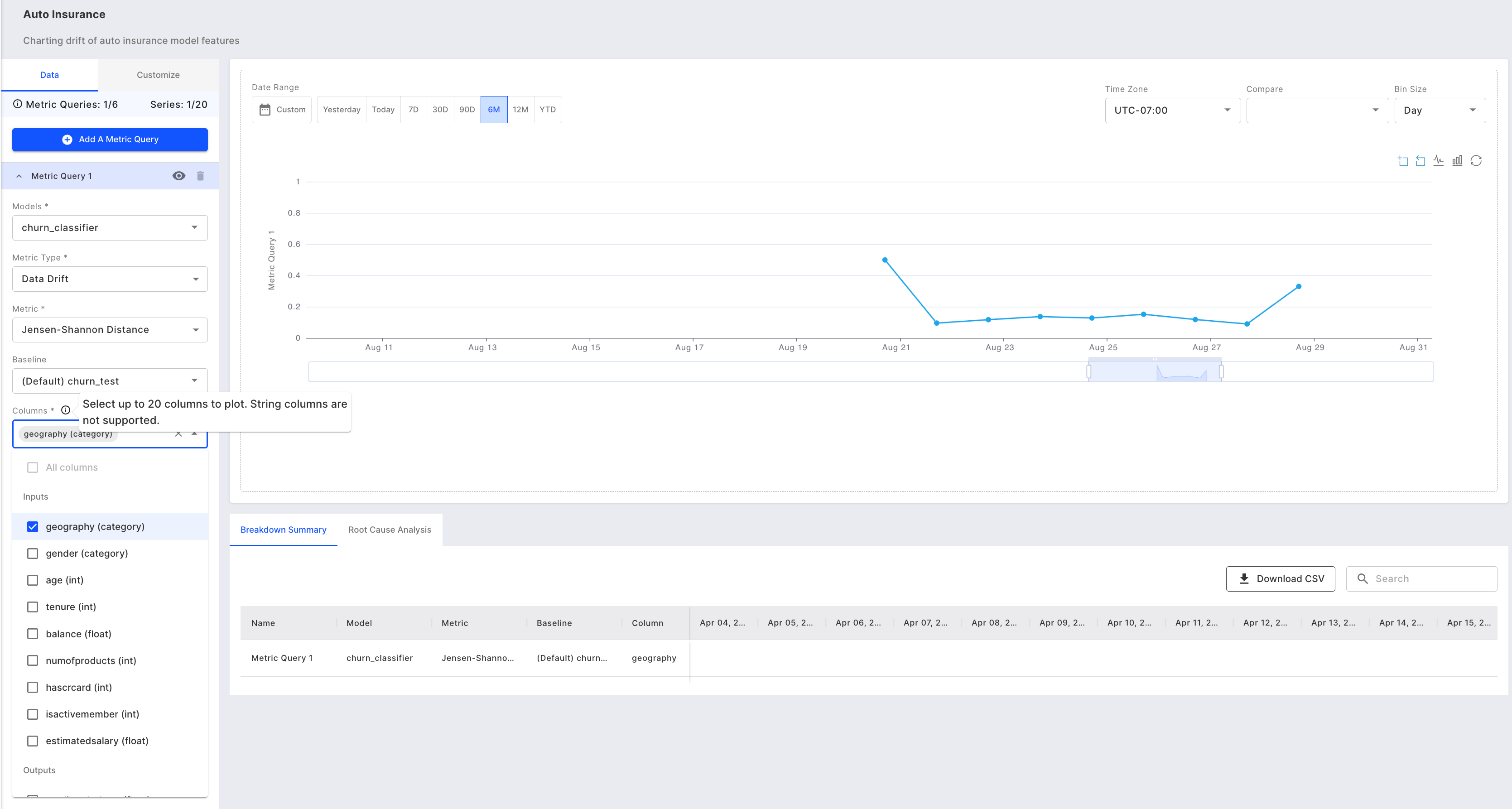
Adding Multiple Metrics or Models
Add up to 6 metric queries that allow you to chart different metrics from one or more models in a single chart view.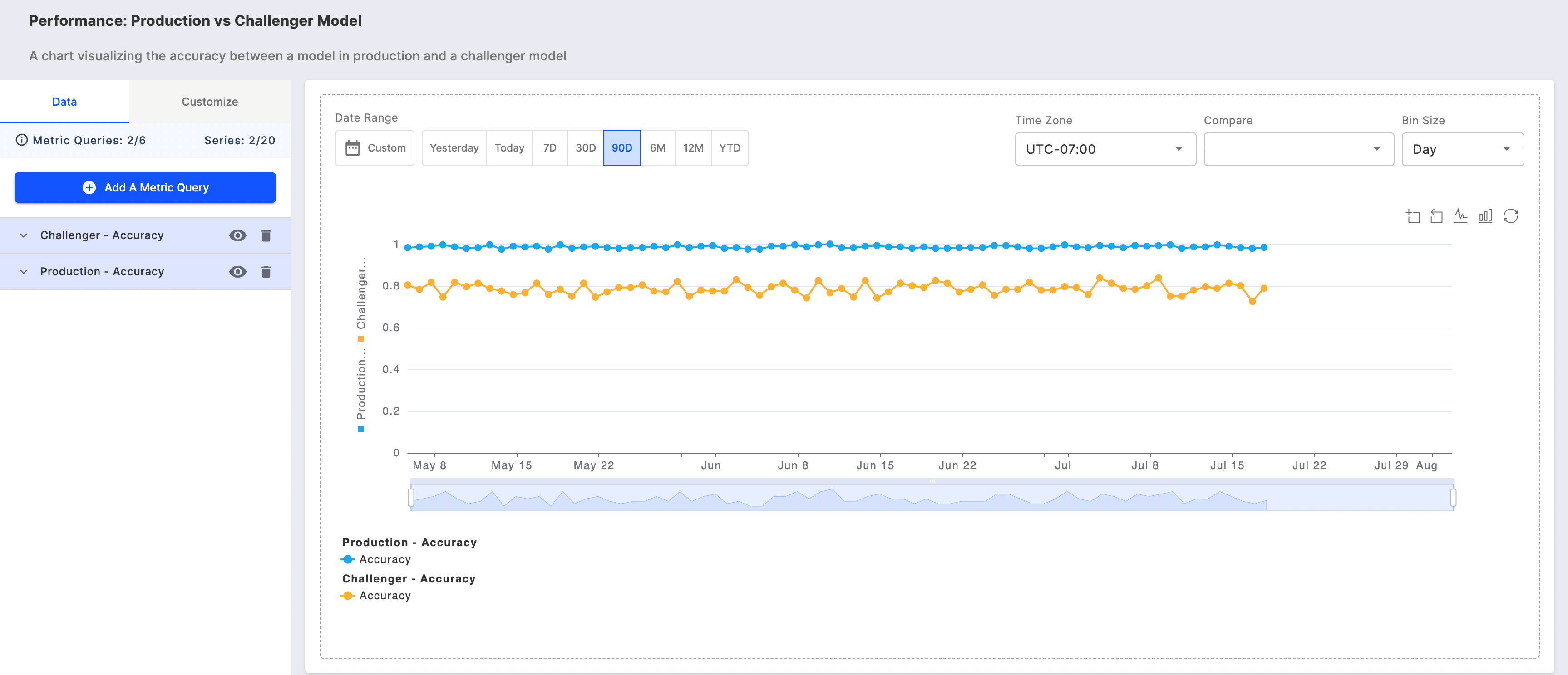
Using Chart Filters for Better Analysis
Analyze specific slices of data using three key filtering tools: chart filters, the chart toolbar, and the zoom slider. These tools work together to help you investigate important patterns and trends in your data.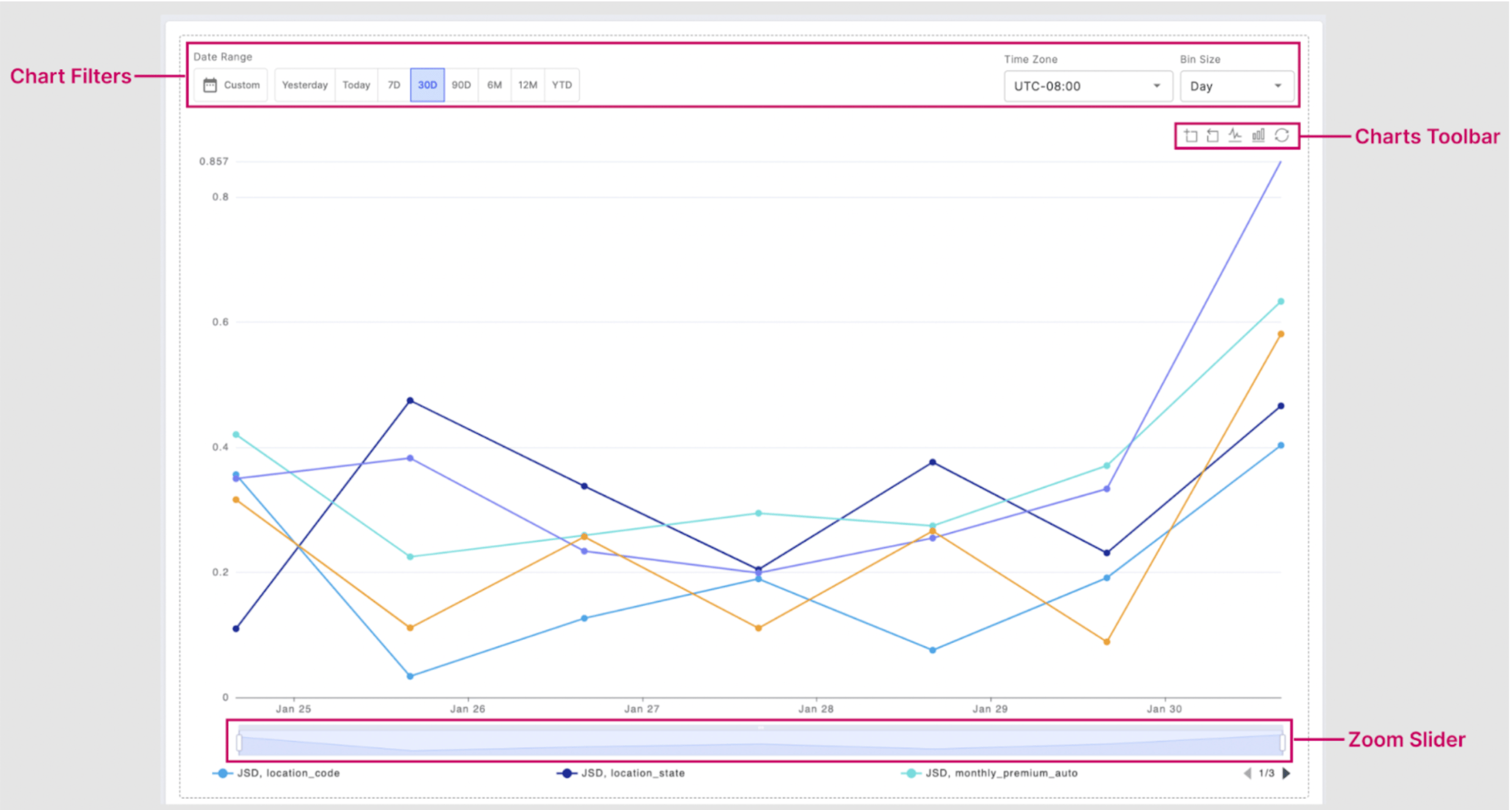
Tailored Filters
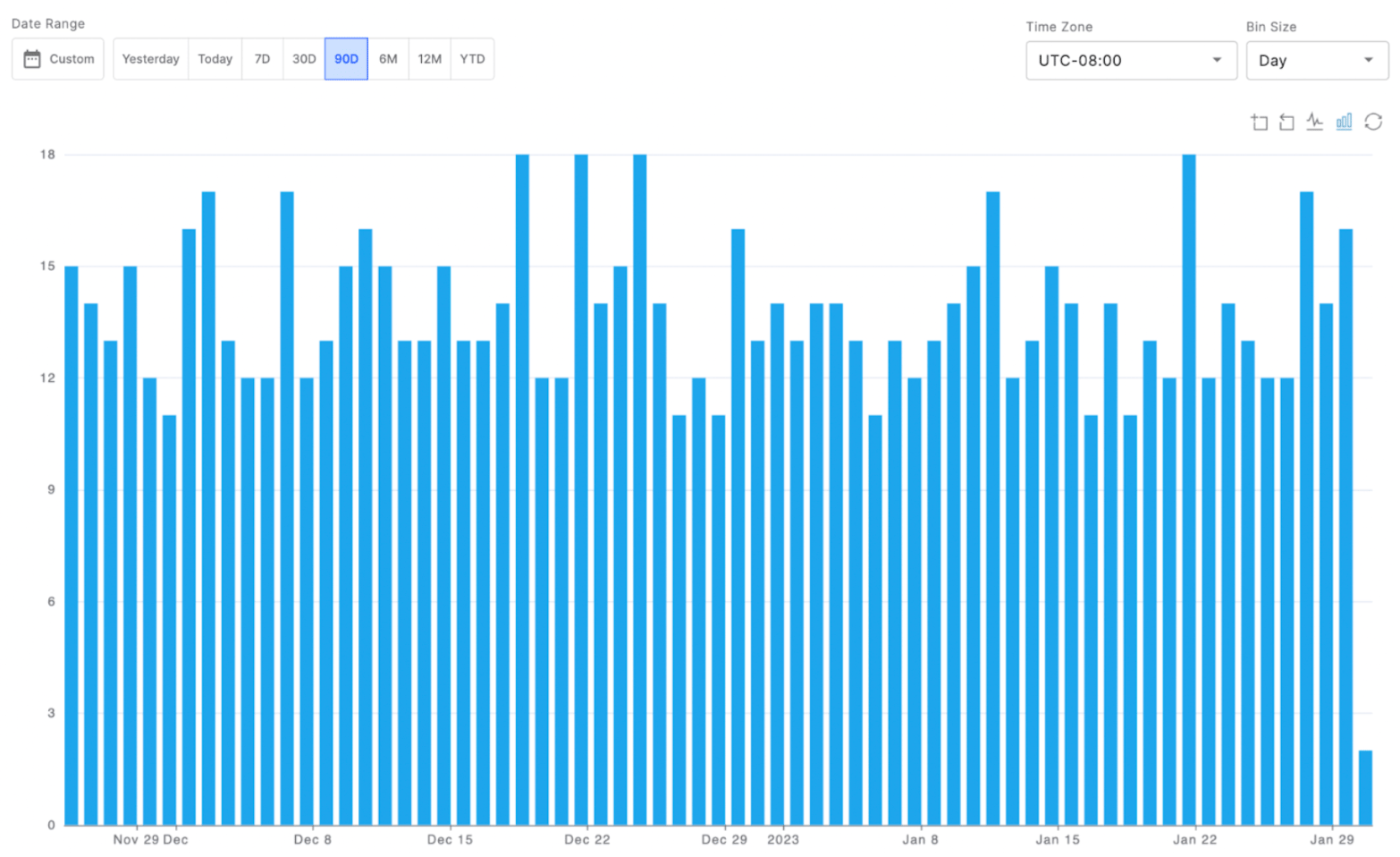
You can customize your chart view using the date range and bin size filters. The date range can be one of the pre-defined time ranges or a custom range. The bin size selected controls the frequency for which the data is displayed. So selecting Day will show daily data over the date range selected. Customize your chart’s time-based display using the date range and bin size filters. Choose from preset date ranges or define a custom period. The bin size determines how your data is grouped - for example, selecting ‘Day’ will show daily aggregated data across your chosen date range.Toolbar Functions
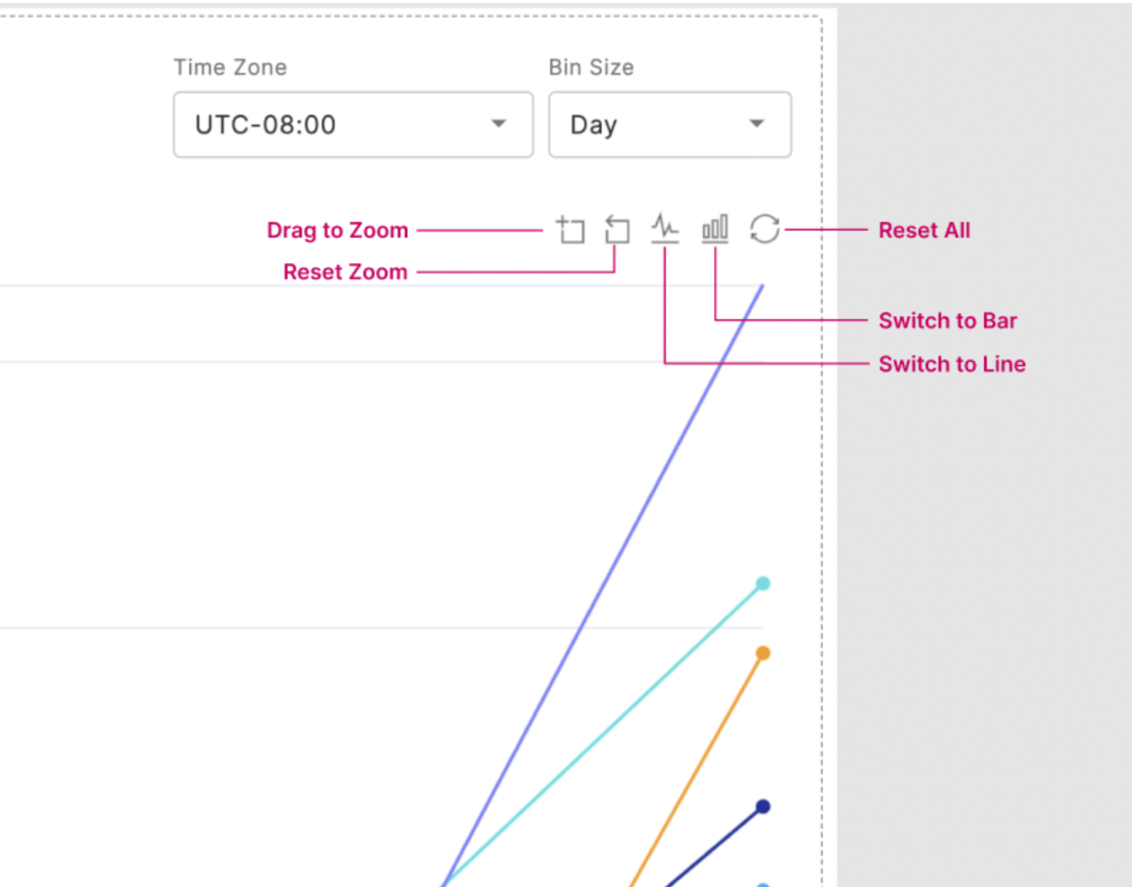
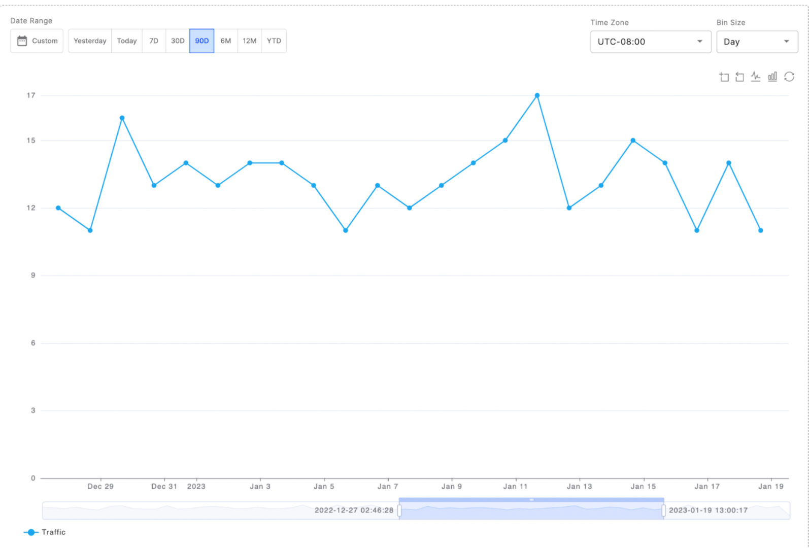
The charts toolbar is made up of 5 functions:- Drag to zoom
- Reset zoom
- Toggle to a line chart
- Toggle to a bar chart
- Undo all toolbar actions
📘 Note: If the zoom reset or toolbar undo is selected, this will also undo any actions taken with the zoom slider.
Breakdown Summary
You can easily visualize your charts’ raw data as a table within the fiddler chart studio, or download the content as a CSV or parquet file for further analysis. If you choose to chart multiple columns, as shown below, you can search for and sort by Model name, Metric name, Column name, or values for a specific date.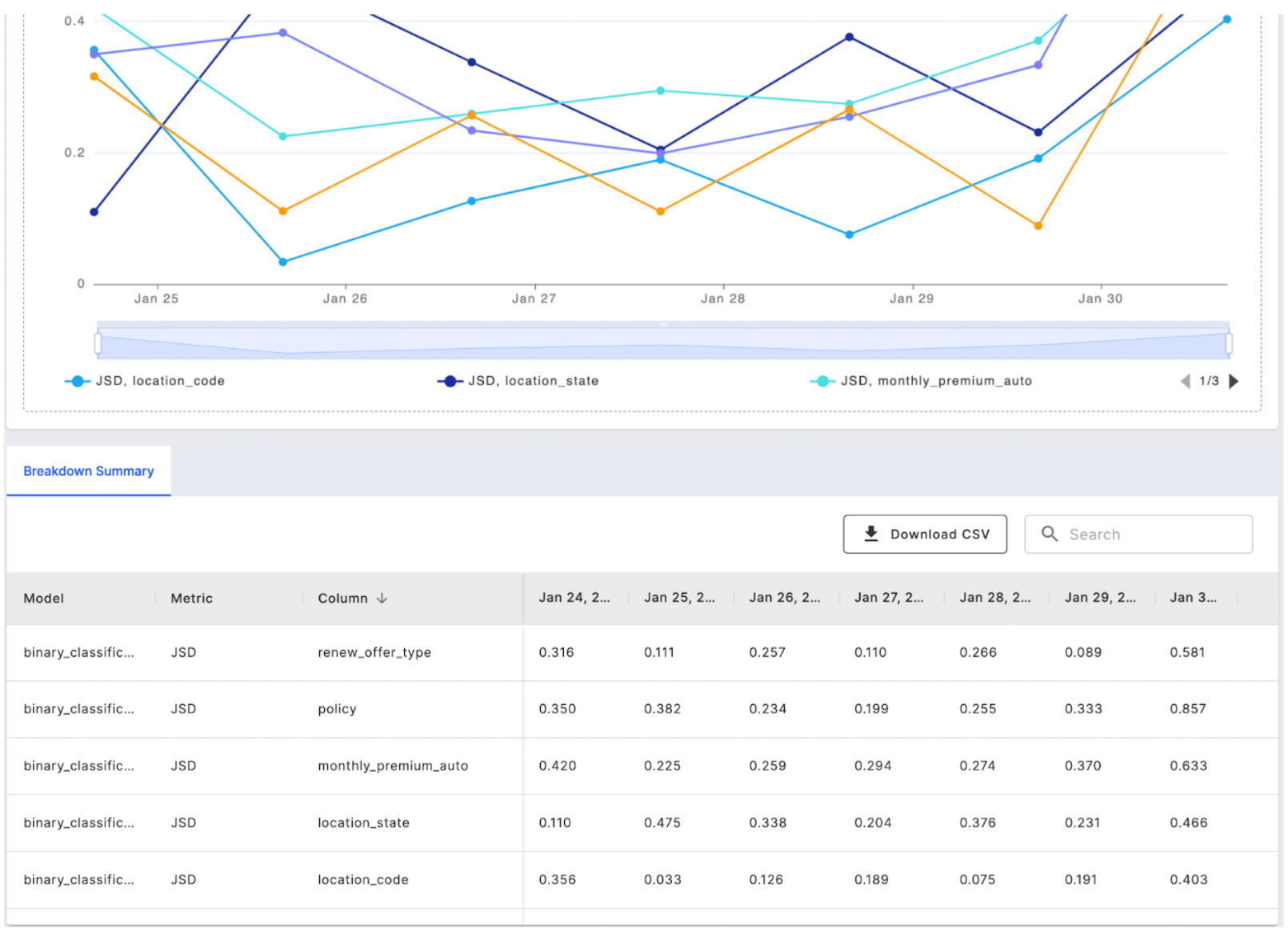
How to Customize Your Monitoring Chart
Adjusting Scale and Range
The Customize tab lets you adjust your chart’s y-axis settings to improve data visualization. You can set minimum and maximum values to better utilize chart space, and apply logarithmic scaling to clearly display data with large variations in values.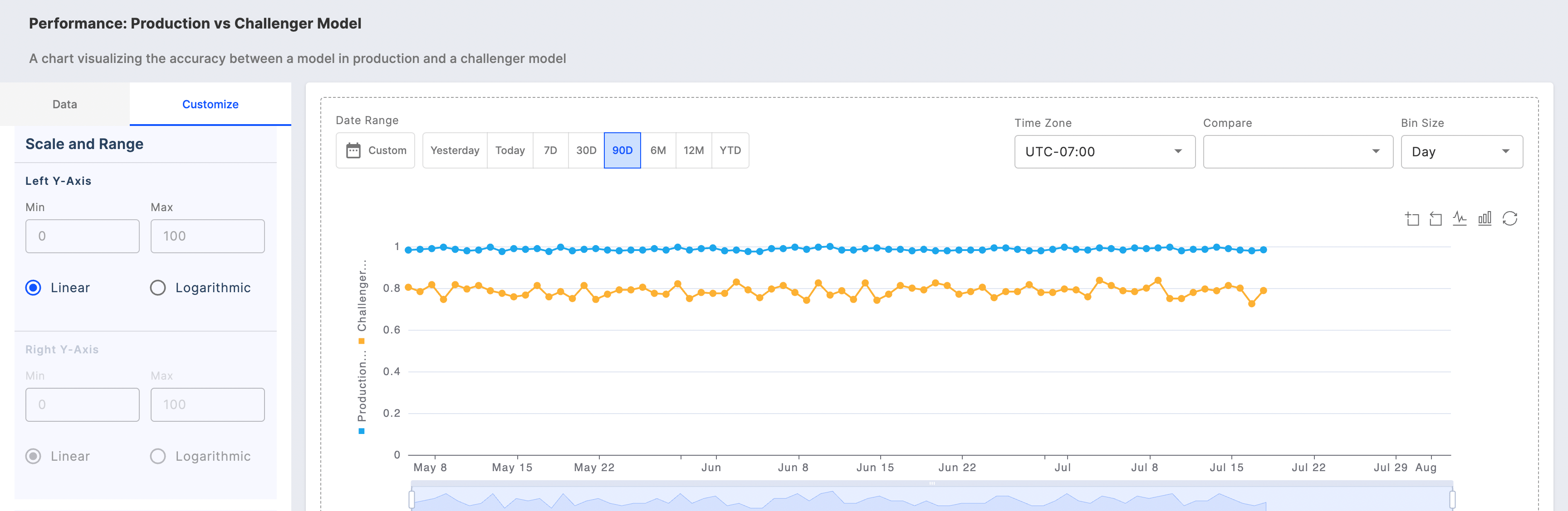
Assigning Y-axis for Metric Queries
Select the y-axis for your metric queries with enhanced flexibility to customize the scale and range for each axis.