UMAP Technique for Embedding Visualization
We use the UMAP (Uniform Manifold Approximation and Projection) technique for embedding visualizations. UMAP is a dimension reduction technique that is particularly good at preserving the local structure of the data, making it ideal for visualizing embeddings. We reduce the high-dimensional embeddings to a 3D space. UMAP is supported for both Text and Image embeddings using a custom featureCreating an Embedding Visualization Chart
To create an embedding visualization chart, follow these steps:- Navigate to the Charts tab in your Fiddler AI instance
- Click on the Add Chart button on the top right
- In the modal, select the project that has a model with Custom features
- Select Embedding Visualization.
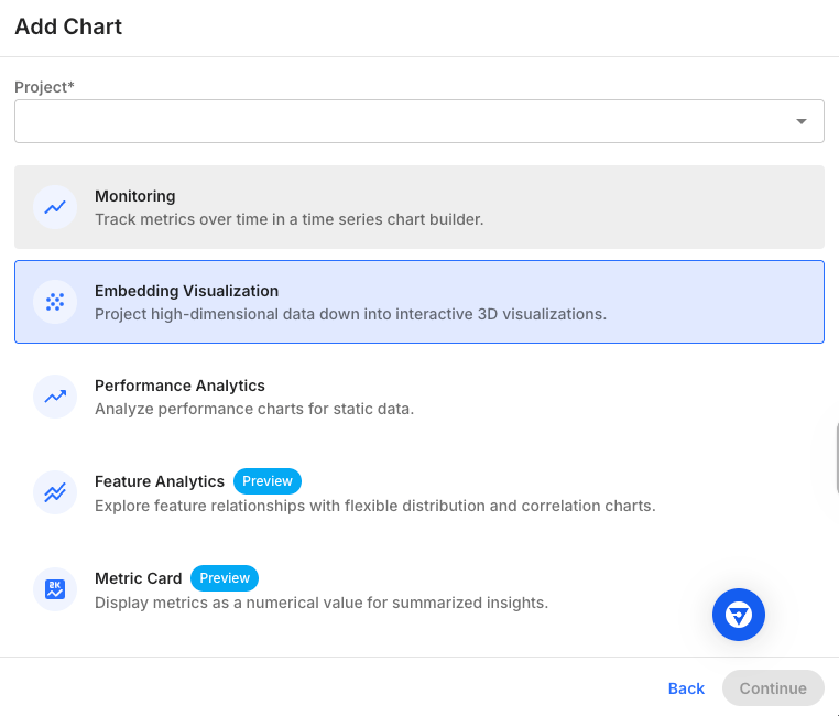
Chart Parameters
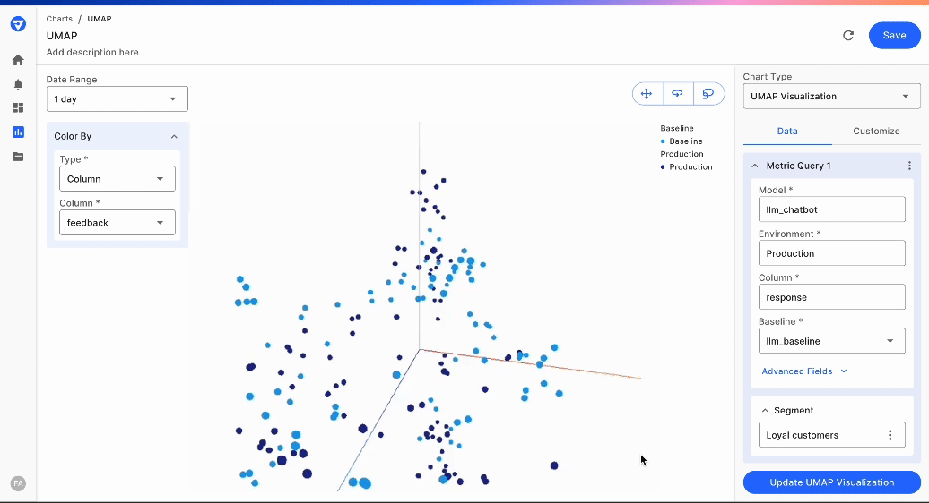
When creating an embedding visualization chart, you will need to specify the following parameters:- Model and model version
- Embedding column
- Display columns
- Baseline
- Segment
- Date range
- Sample size
- Advanced fields
- Number of neighbors
- Minimum distance
- Distance metric
Model
Select the model containing at least one embedding column. You may further refine to a model version if required.Embedding Column
Choose the embedding column from your dataset that you wish to visualize.Display Columns
Select the columns for which you want to display additional information when hovering over points in the visualization. When plot points are selected, these additional display columns will also be available in the data cards.Baseline
Select a baseline for comparison. This is optional and will be helpful when comparing datasets, such as a pre-production dataset with a production dataset or two time periods in production.Segment
Select an existing segment (or define a new segment) to filter the chart to a particular data cohort. This is optional, but it will be helpful when focusing on a specific cohort.Sample Size
Decide the number of samples you want to include for performance and clarity in the visualization. Currently, sample sizes between 100 and 10,000 can be selected. In future releases, we will enable support for larger sample sizes.Number of Neighbors
This parameter controls how UMAP balances local versus global structure in the data. It determines the number of neighboring points used in the manifold approximation. Low values of this parameter, such as 5, will lead UMAP to focus too much on the local structure, losing sight of the big picture. Conversely, bigger values will lead to a focus on the broader data. It is important to experiment on your dataset and use case to identify the value that provides the best results. Values from 2 to 100 are supported.Minimum Distance
Controls how closely points can be placed to each other in the visualization. A smaller value (such as 0.1) allows points to cluster more tightly, revealing finer details and local structures in your data. A larger value forces points to spread out more evenly across the visualization space.Interactions on Embedding Visualization
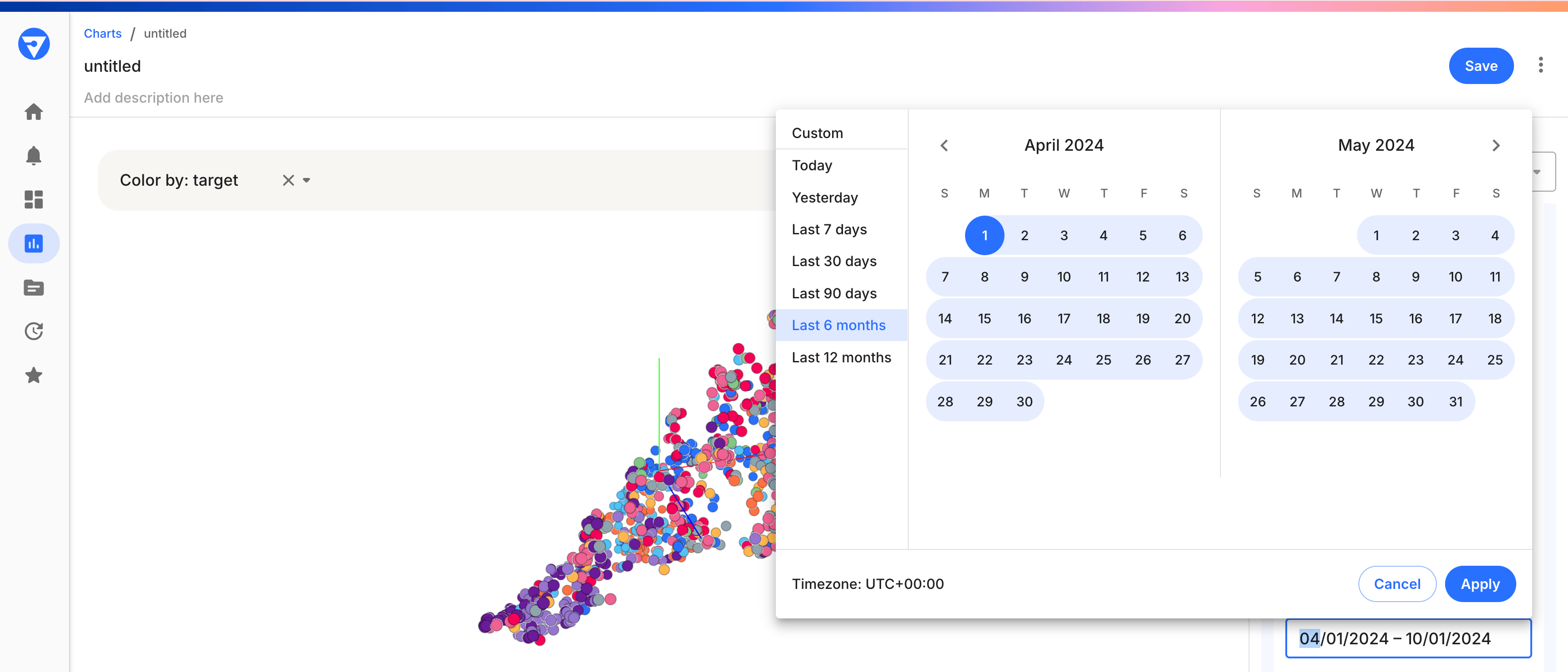
Choose Different Periods
When generating the embedding visualization, you can choose different periods of production data to analyze. To do this:- Access the Date Range selector.
- Choose the start and end dates for the period you are interested in.
- The visualization will update to reflect the embeddings from the selected date range.
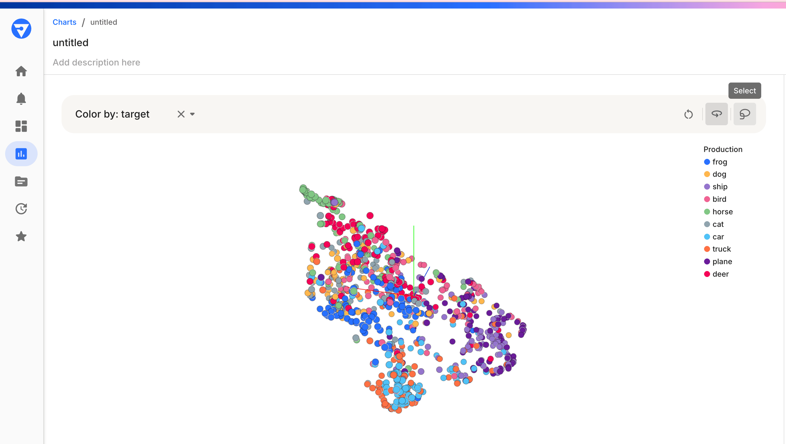
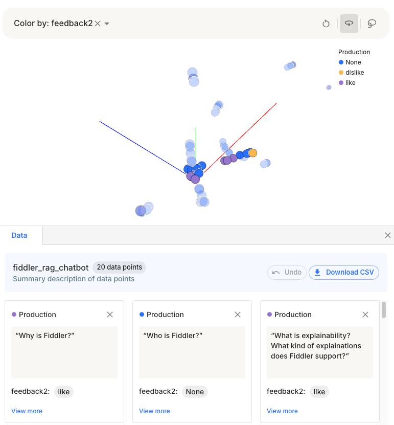
Color By
The ‘Color By’ feature enriches the visualization by categorizing your data points using different colors based on attributes.- Find the ‘Color By’ dropdown in your control panel.
- Choose a categorical feature to color-code the data points. For example, select “data source” to color the data points according to whether they are baseline or production data.
Zoom
Zooming in on the UMAP chart provides a closer look at clusters and individual data points.- Use the mouse scroll wheel to zoom in or out.
- Click and drag the mouse to move the zoomed-in area around the chart.
- Zooming helps to focus on areas of interest or to distinguish between closely packed points.
Selection of Data Points
You can select individual or groups of data points to analyze further.- Click on a data point to select it. Or use the Selector on the top right to select multiple points
Data Cards
- Selected points will be highlighted on the chart, and details of the display columns of these cards are displayed in data cards, as shown below
- Use this feature to identify and analyze specific data points
Hover on a Data Point
Hovering over a data point reveals additional information about it, providing immediate insight without the need for selection.- Move the cursor over a data point on the chart
- A tooltip will appear, displaying the data associated with that point, such as values of different display columns
- Use this feature to quickly look up data without altering your current selection on the chart