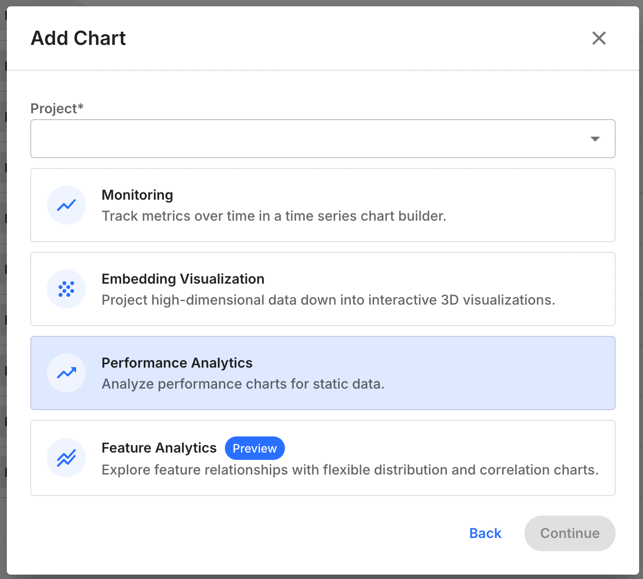
Creating a Feature Analytics Chart
To create a Feature Analytics chart, follow these steps:- Navigate to the
Chartstab in your Fiddler AI instance - Click on the
Add Chartbutton on the top right - In the modal, select a project
- Select Feature Analytics
Support
Feature analytics is supported for any model task type, but does not support time stamps or columns of typestring or vector.
Available Right-Side Controls
Available In-Chart Controls
Displays for Feature Distribution
Kernel Density Estimate
For numeric column types, visualize feature distribution as a Kernel Density Estimate chart.
Histogram
Categorical and boolean value may only be displayed as Histograms, but other column types may also be displayed as such.
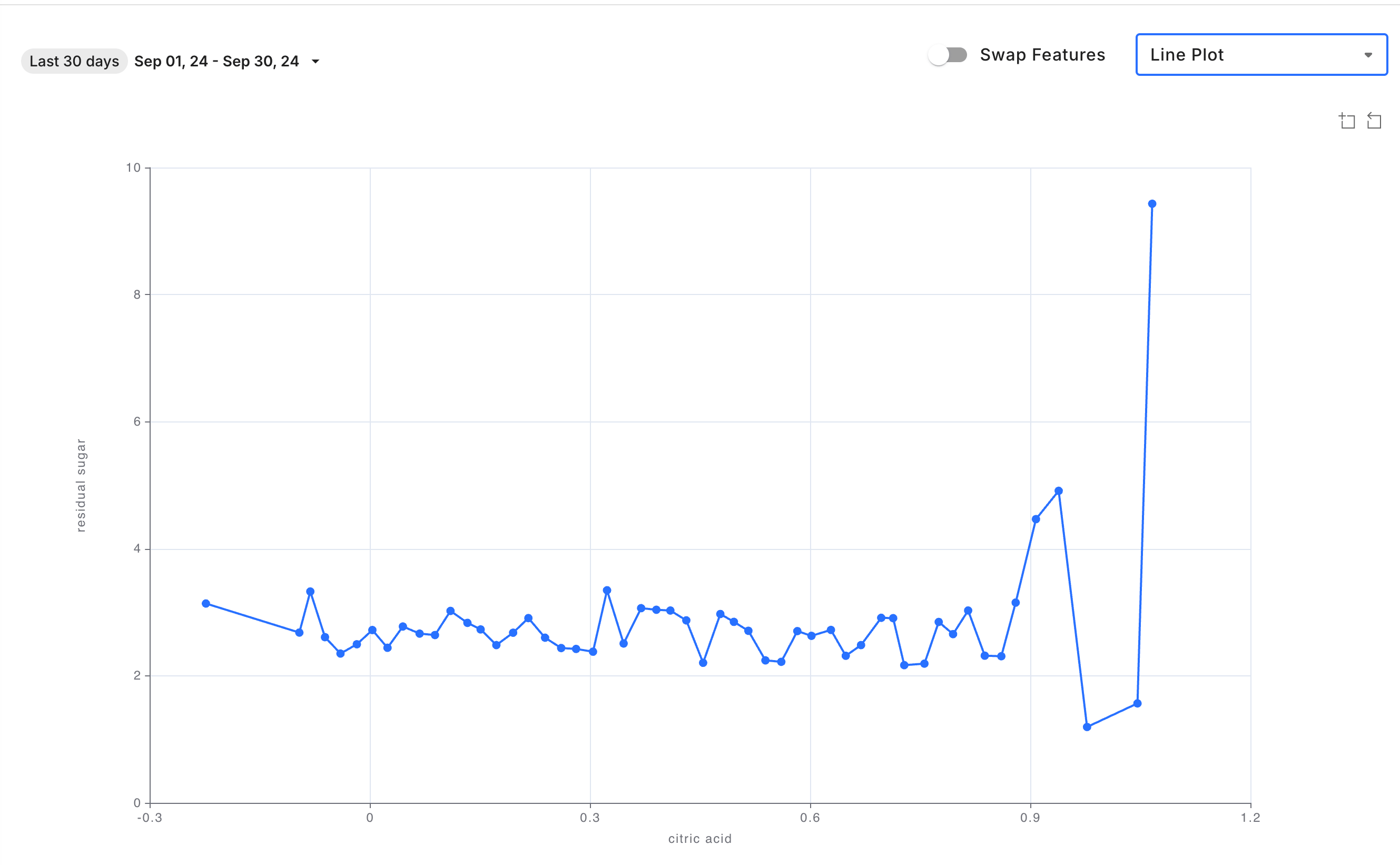
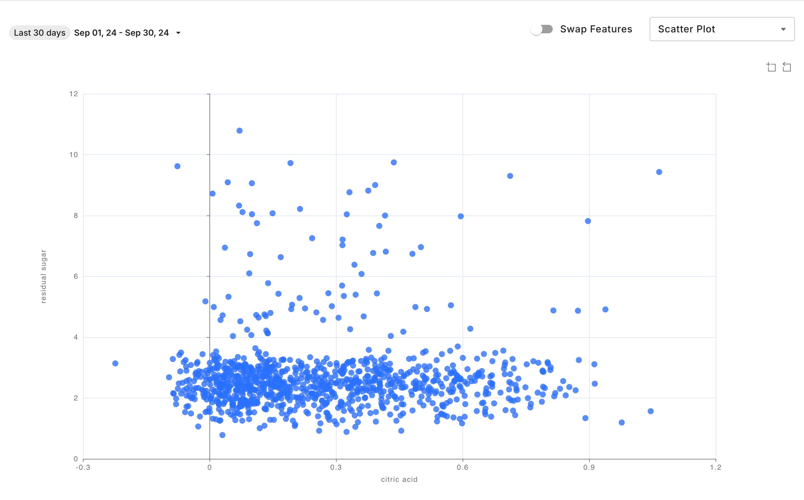
Displays for Feature Correlation
Line Plot
Scatter Plot
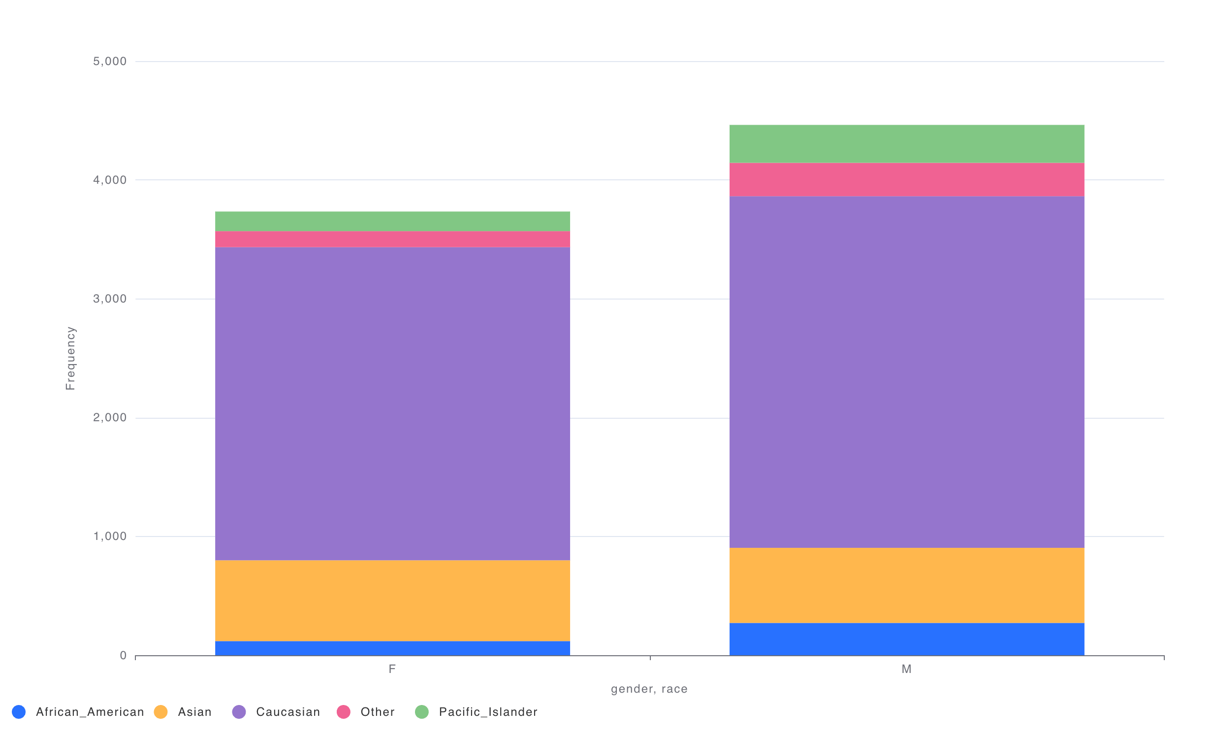
Stacked Bar Plot
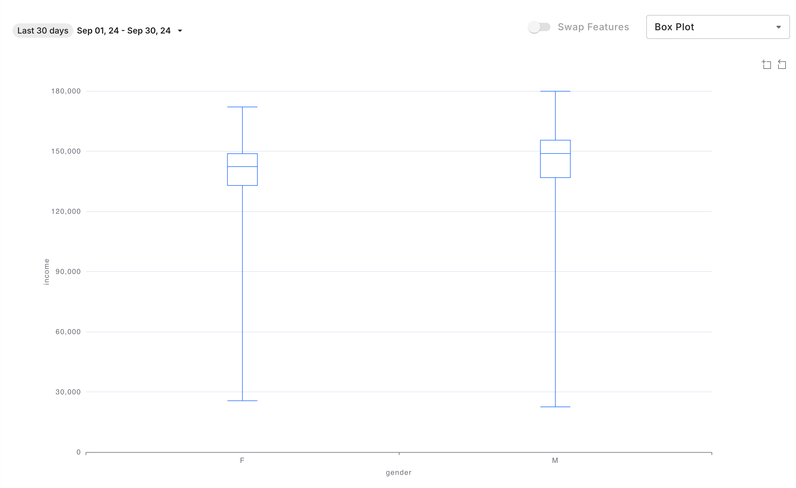
Box Plot
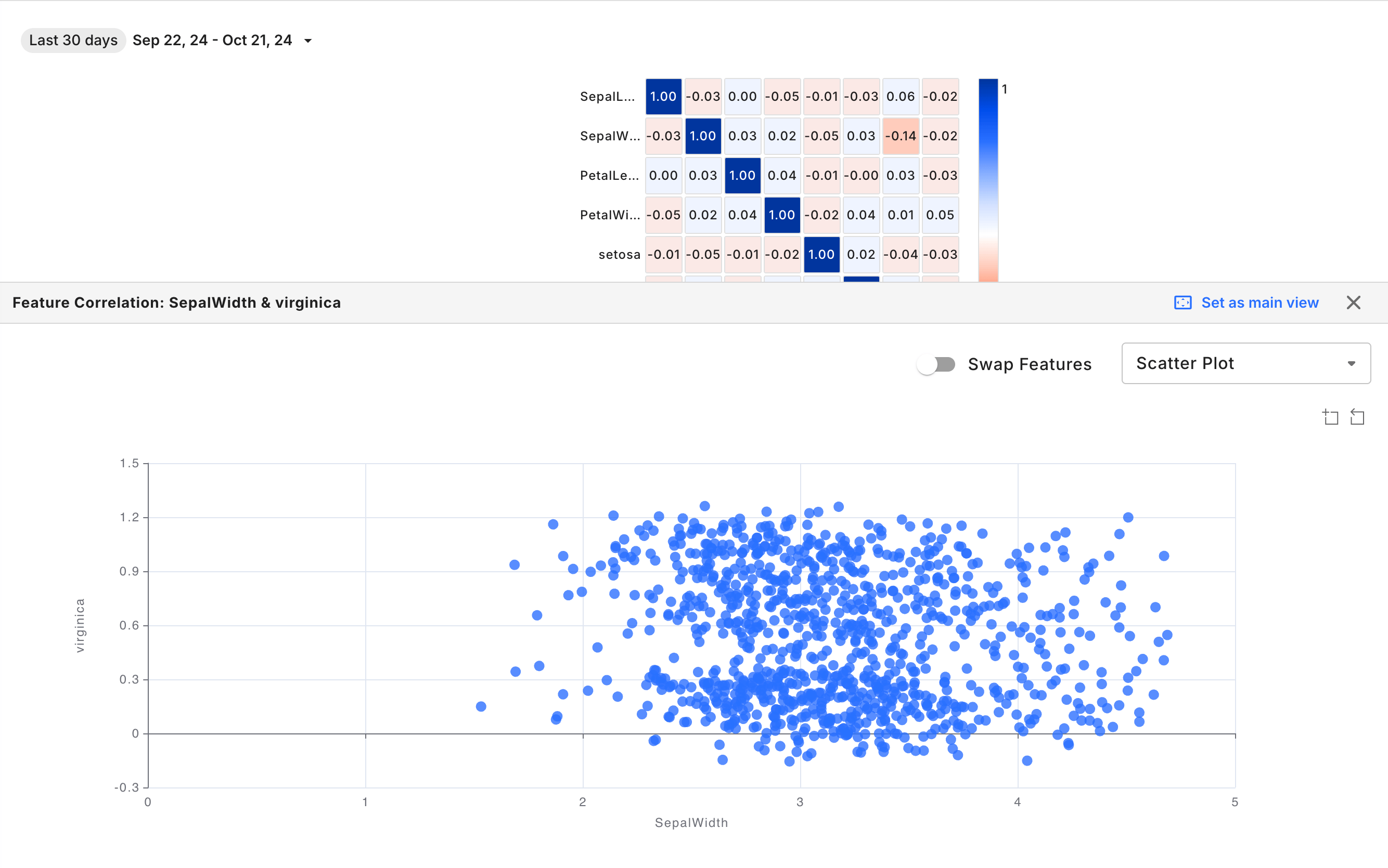
Correlation Matrix Interactions
Clicking a cell in the correlation matrix opens the Feature Correlation chart, enabling a more detailed analysis of the relationship between the selected features.