Analyzing a Sample of Events
- Navigate to the
Chartstab in your Fiddler AI instance - Click on the
Add Chartbutton on the top right - In the modal, select a project
- Select Monitoring
- Create a Monitoring chart and click on a time range
- This will display the RCA (Root Cause Analysis) tab
- In RCA, select the
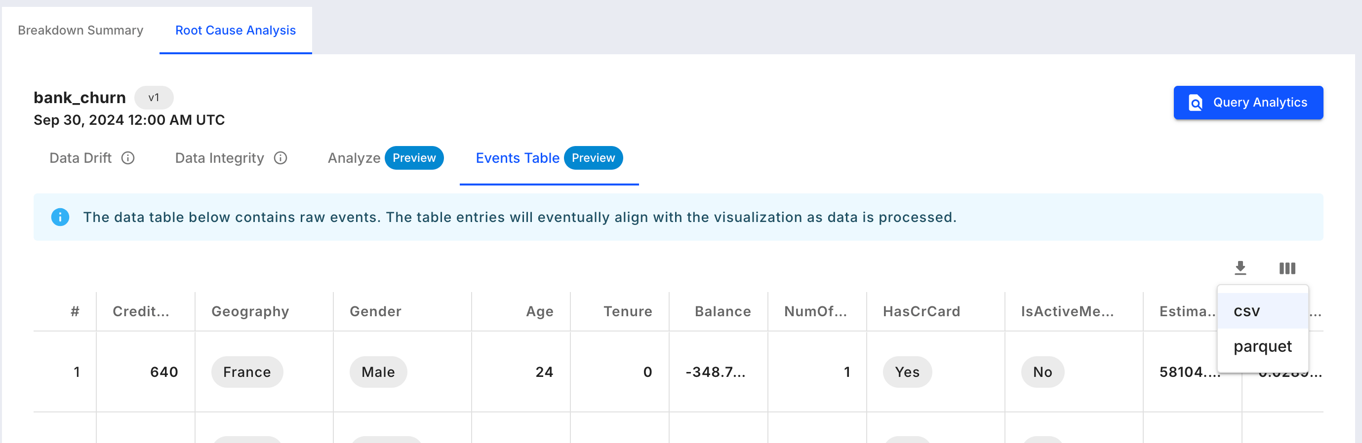
Events Tabletab
Support
This visualization is supported for any model and data type.Represented data
The displayed events are production events coming from the selected model and bin, and segment if it was selected in the monitoring chart.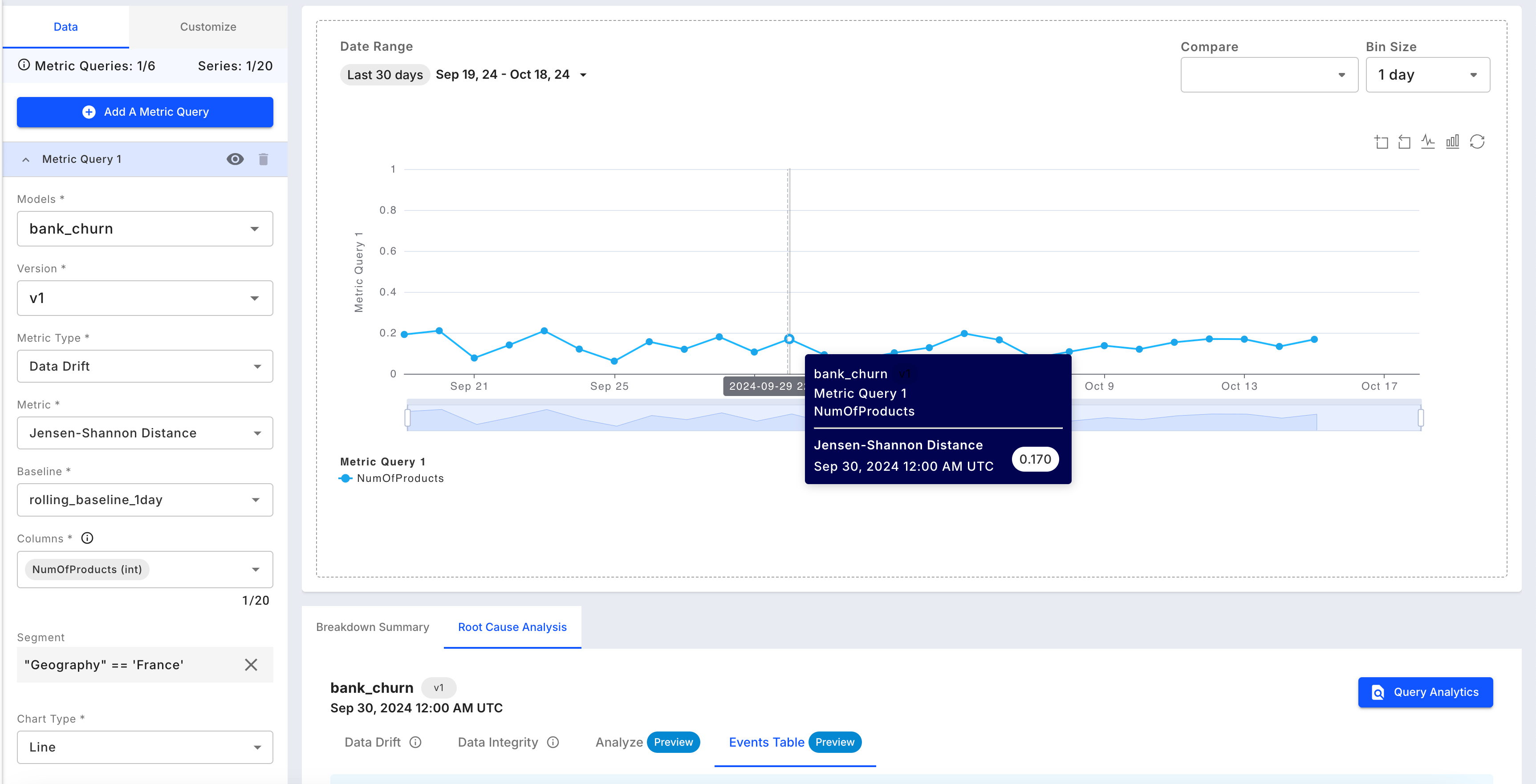
Available Controls
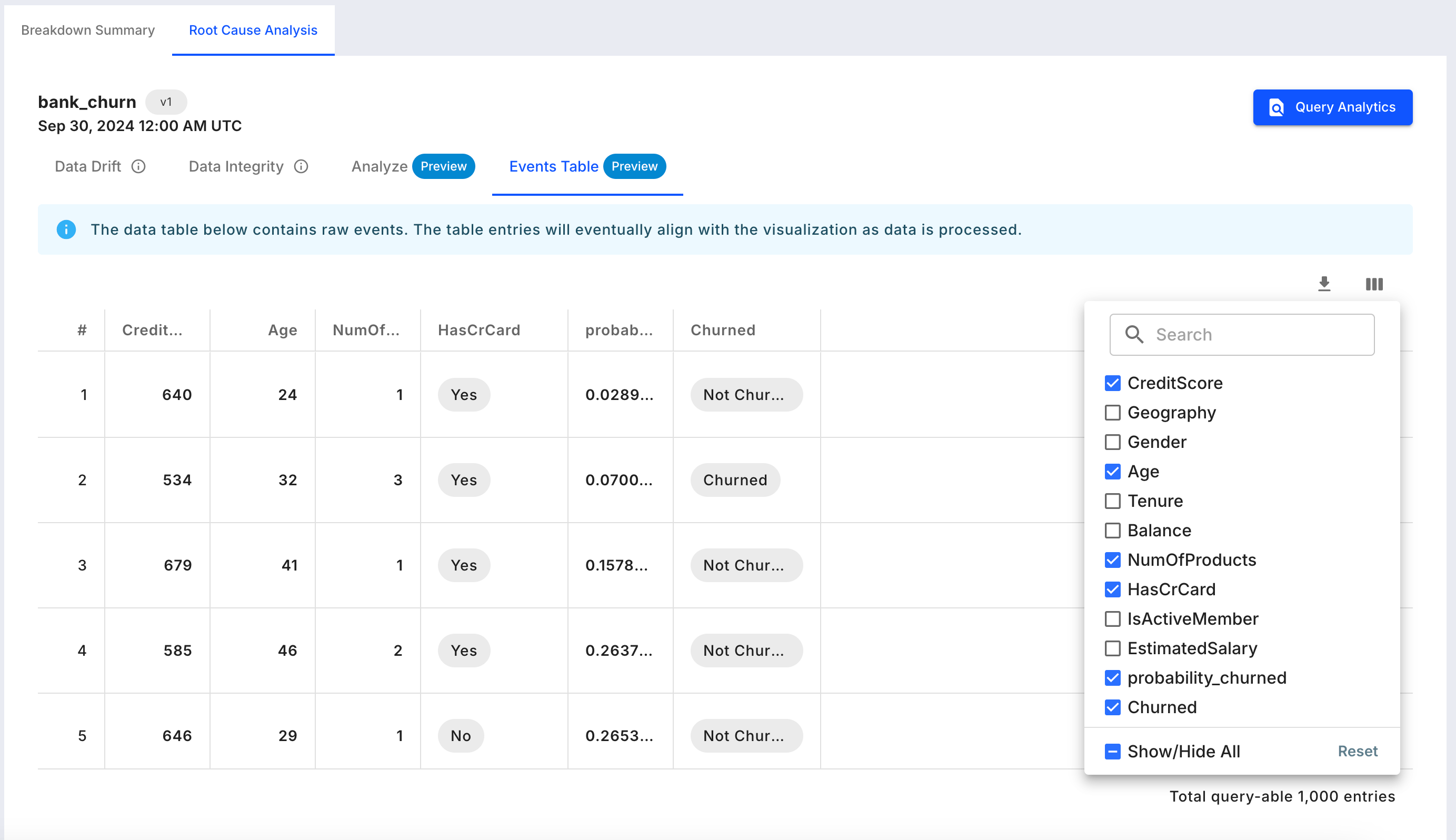
- Column selection: On the top right side of the table, select the columns to be displayed. By default all non-vector columns are displayed.
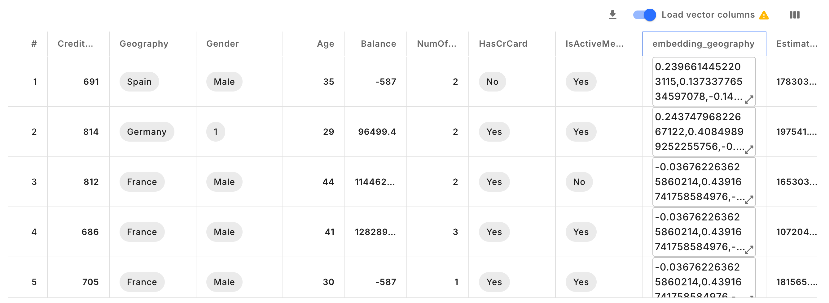
- Vector columns: By default the vector columns are not fetched for latency reasons. Toggle on if vectors need to be fetched.
- Download: Download the sample events to
CSVorPARQUETformat.