Creating Dashboards
To begin using our dashboard feature, navigate to the dashboard page by clicking on “Dashboards” from the top-level navigation bar. On the Dashboards page, you can choose to either select from previously created dashboards or create a new one. This simple process allows you to quickly access your dashboards and begin monitoring your models’ performance, data drift, data integrity, and traffic.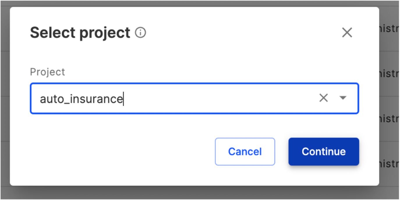
Auto-Generated Dashboards
Fiddler will automatically generate model monitoring dashboards for all models registered to the platform. Depending on the task type, these dashboards will include charts spanning Performance, Traffic, Drift, and Data Integrity metrics.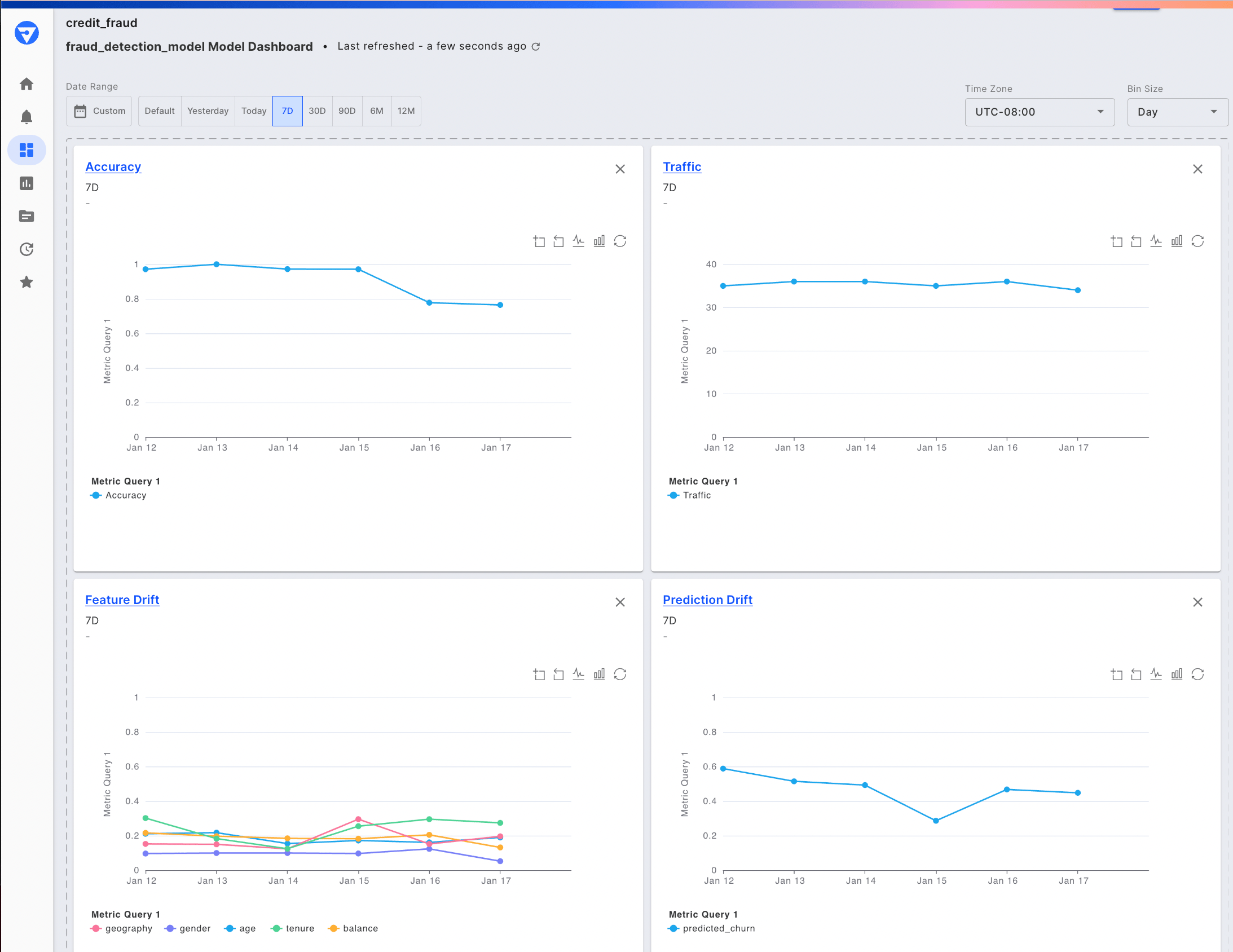
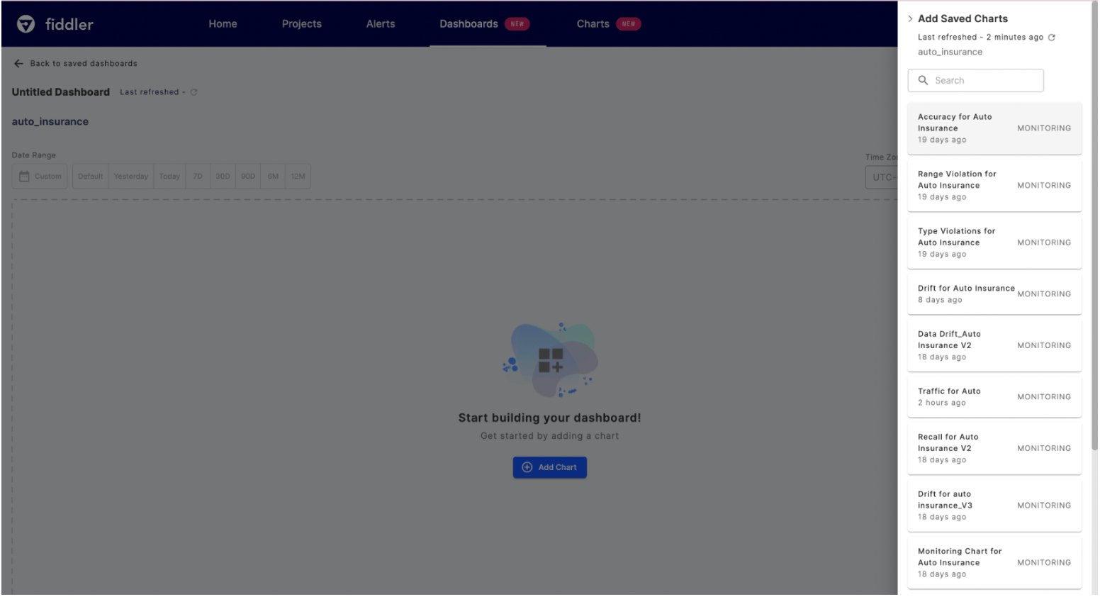
Add Monitoring Charts
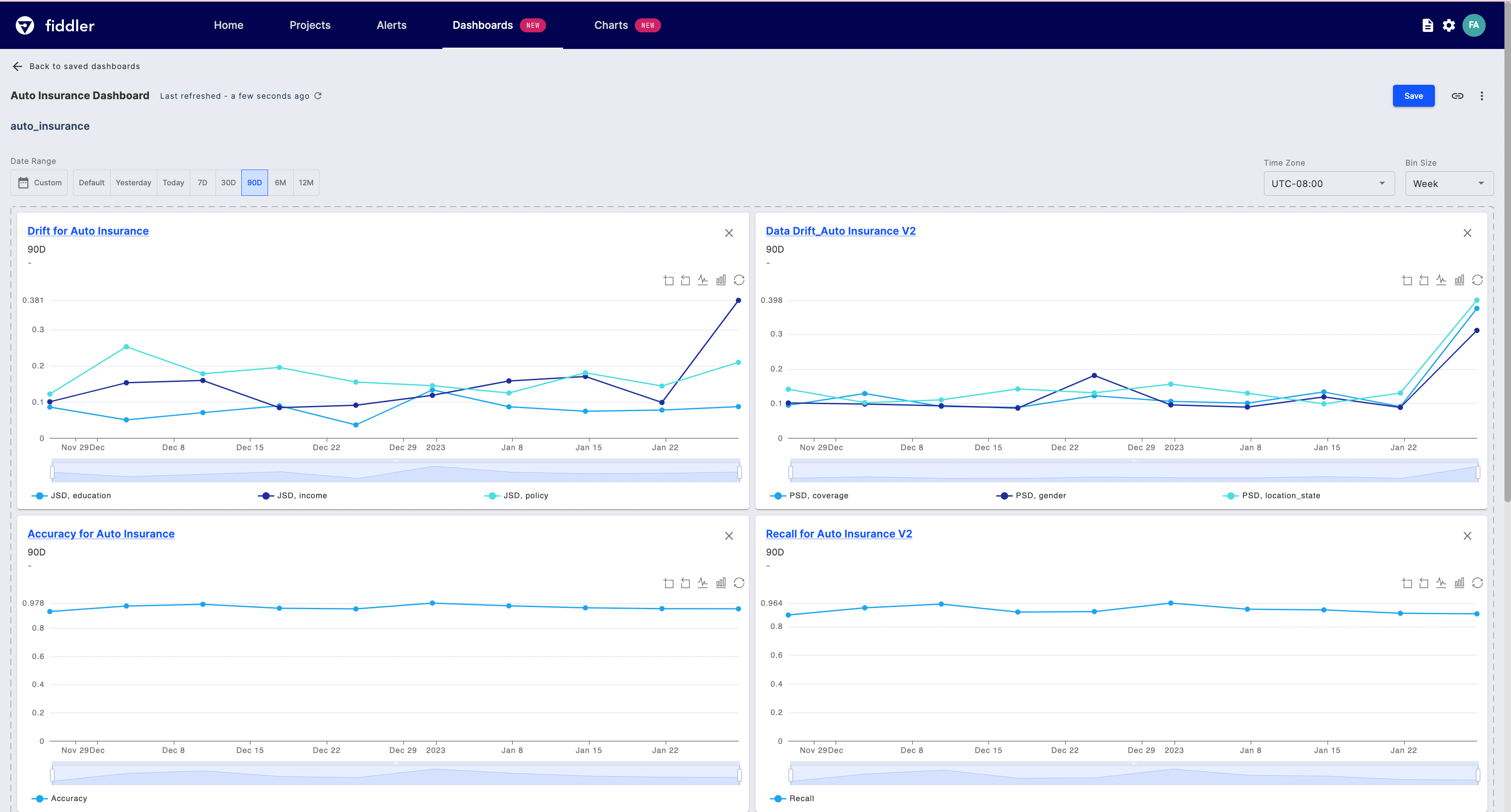
Once you’ve created a dashboard, you can add previously saved monitoring charts that display these metrics over time, making it easy to track changes and identify patterns.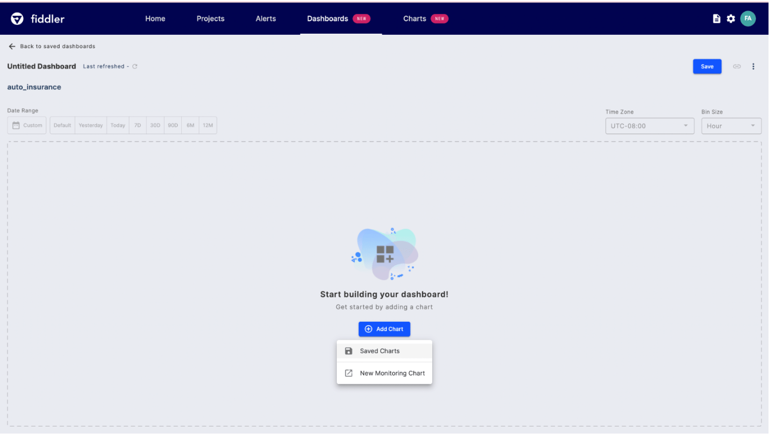
Dashboard Filters
There are three main filters that can be applied to all the charts within dashboards, these include date range, time zone, and bin size.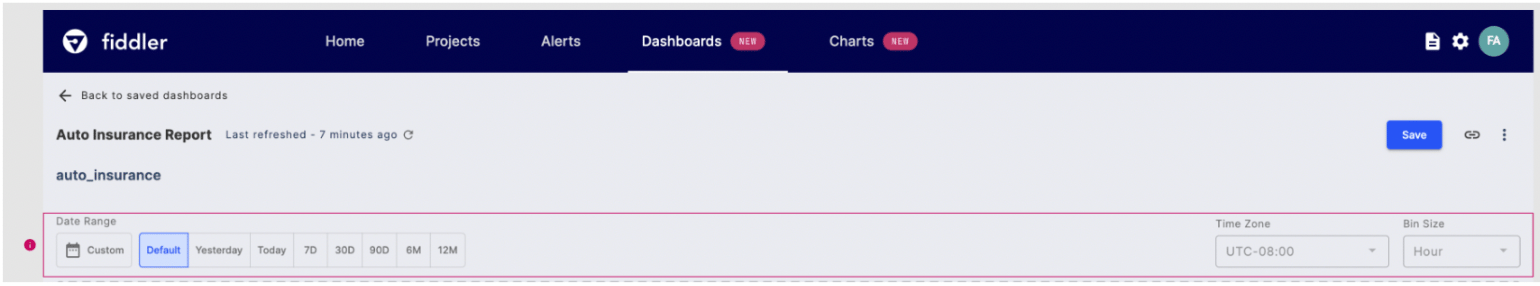
Date Range
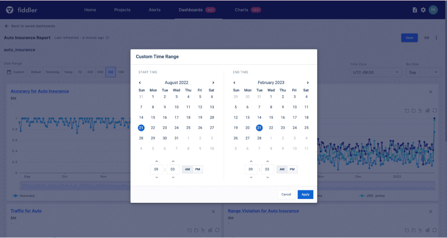
When theDefault time range is selected, the data range, time zone, and bin size that each monitoring chart was originally saved with will be applied. This enables you to create a dashboard where each chart shows a unique filter set to highlight what matters to each team. Updating the date range will unlock the time zone and bin size filters. You can select from a number of predefined ranges or choose Custom to select a start and end date-time.
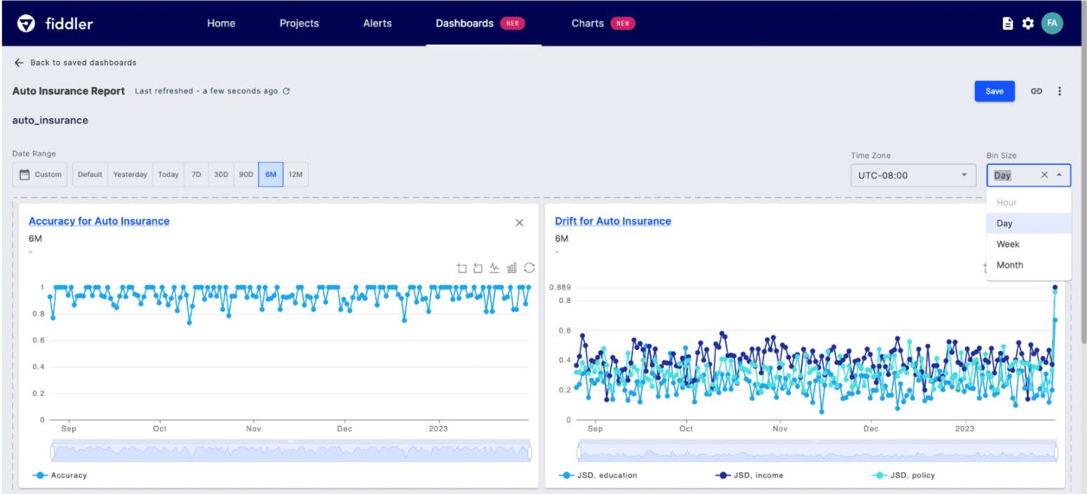
Bin Size
Bin size controls the frequency at which data is displayed on your monitoring charts. You can select from the following bin sizes:Hour, Day, Week, or Month.
📘 Note: Hour bin sizes are not supported for time ranges above 90 days. For example, if we select the6Mdata range, we see that theHourlybin selection is disabled. This is disabled to avoid long computation and dashboard loading times.
Saved Model Updates
If you recently created or updated a saved chart and are not seeing the changes either on the dashboard itself or the Saved Charts list, click the refresh button on the main dashboard studio or within the saved charts list to reflect updates.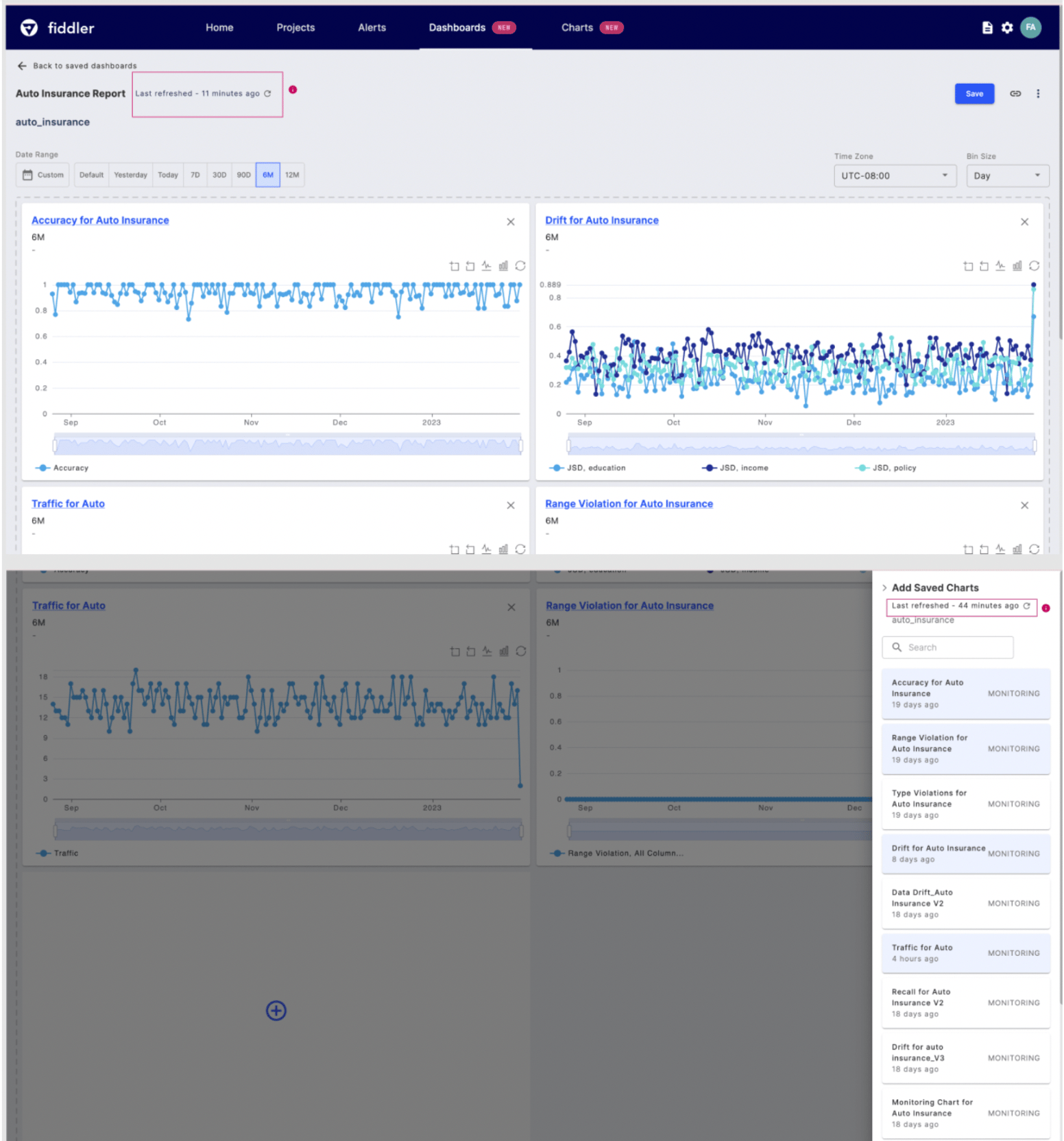
Model Comparison
With our dashboard feature, you can also compare multiple models side-by-side, making it easy to see which models are performing the best and which may require additional attention. To create model-to-model comparison dashboards, ensure the models you wish to compare belong to the same project. Create the desired charts for each model and then add them to a single dashboard. By creating a single dashboard that tracks the health of all of your models, you can save time and simplify your AI monitoring efforts. With these dashboards, you can easily share insights with your team, management, or stakeholders, and ensure that everyone is up-to-date on your AI performance.