Embedding Visualization Chart Creation
Creating an embedding visualization Chart
To create an embedding Visualization chart, follow these steps:
- Navigate to the Charts tab in your Fiddler AI instance
- Click on the Add Chart button on the top right
- In the modal, Select the project that has a model with Custom features
- Select Embedding Visualization.
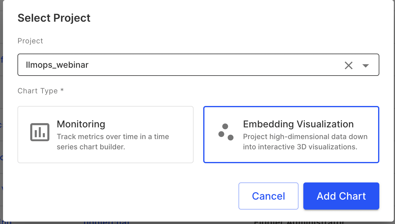
Chart Parameters
When creating an embedding visualization chart, you will need to specify the following parameters:
- Model
- Custom Feature Column
- Baseline
- Display Columns
- Sample size
- Number of Neighbors
- Minimum distance
Please see below for details on these parameters.
Model
Select the model (with custom features) for which you want to visualize the embeddings.
Custom Feature Column
Choose the custom feature column from your dataset that you wish to visualize.
Baseline
Define a baseline for comparison. This is optional and will be useful when you want to compare datasets such as a pre-production dataset with a production dataset or two time periods in production.
Display Columns
Select the columns that you want to display additional information for when hovering over points in the visualization. These additional display columns will also be available in the data cards when points are selected.
Sample Size
Decide on the number of samples you want to include in the visualization for performance and clarity. Currently, a sample size of either 100, 500, or 1000 can be selected. In future releases, we will enable support for larger sample sizes.
Number of Neighbors
This parameter controls how UMAP balances local versus global structure in the data. It determines the number of neighboring points used in the manifold approximation. Low values (for example: 5) of this parameter will lead UMAP to focus too much on the local structure losing sight of the big picture, alternatively, bigger values will lead to a focus on the broader data. It is important to experiment on your dataset and use case to identify a value that works best for you.
Minimum Distance
Set the minimum distance apart that points are allowed to be in the low-dimensional representation. Smaller values (for example: 0.1) will result in a more clustered embedding, which can highlight finer details.
Interactions on embedding visualization
Choose Different Time Periods
When generating the embedding visualization, you have the flexibility to choose different time periods of production data to analyze. To do this:
- Access the time period selector.
- Choose the start and end dates for the time period you are interested in.
- The visualization will update to reflect the embeddings from the selected timeframe.
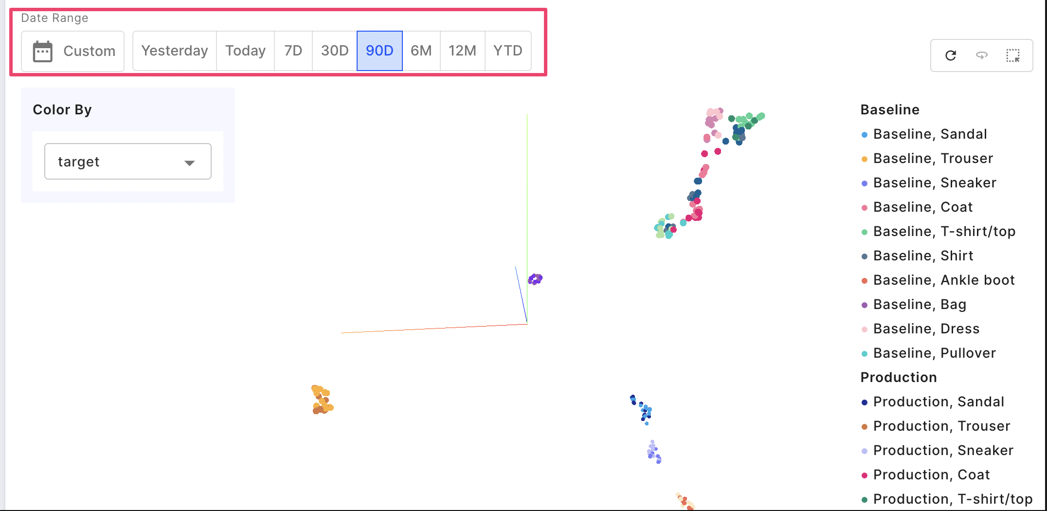
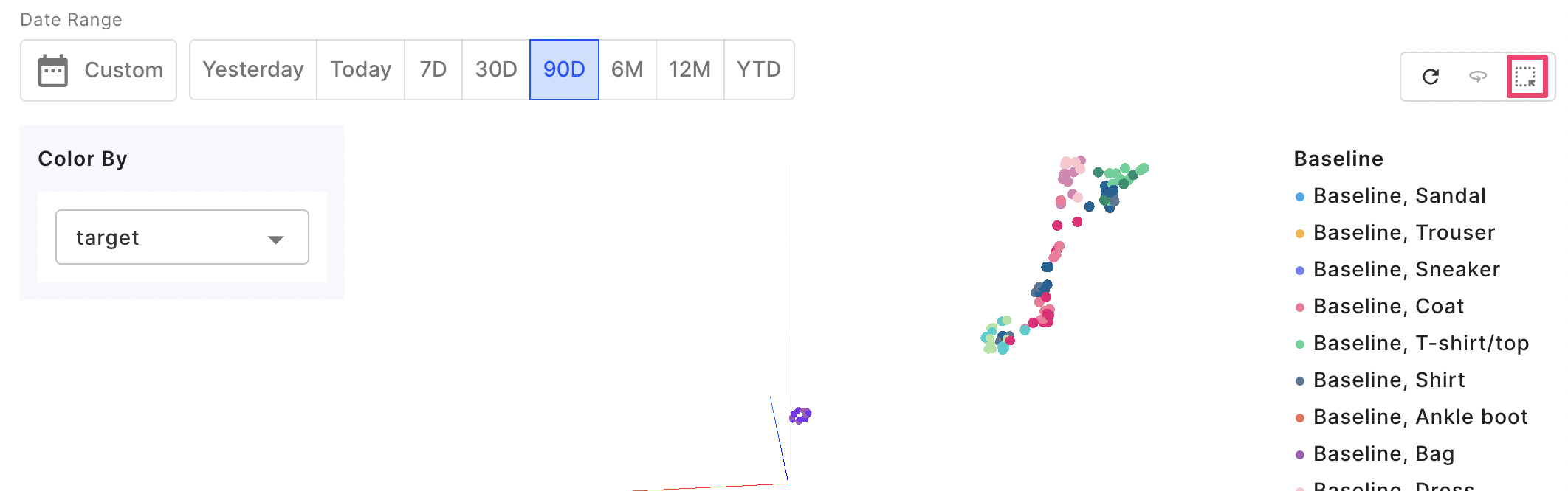
Color By
The 'Color By' feature enriches the visualization by categorizing your data points using different colors based on attributes.
- Find the 'Color By' dropdown in your control panel.
- Choose a categorical feature to color-code the data points. For instance, in the above image, the data points are assigned colors based on a 'target' categorical column. This attribute includes categories like Sandal, Trouser, and Pullover, as indicated in the legend.
Using the 'Color By' feature can assist in uncovering patterns in your data. For instance, in the above image, data points with varying 'target' column values demonstrate clustering, where similar values tend to group together.
You can also select points to delve deeper for further inspection. You may find this ability to interactively color and select data points very useful for root cause analysis.
Zoom
Zooming in on the UMAP chart provides a closer look at clusters and individual data points.
- Use the mouse scroll wheel to zoom in or out.
- Click and drag the mouse to move the zoomed-in area around the chart.
- Zooming helps to focus on areas of interest or to distinguish between closely packed points.
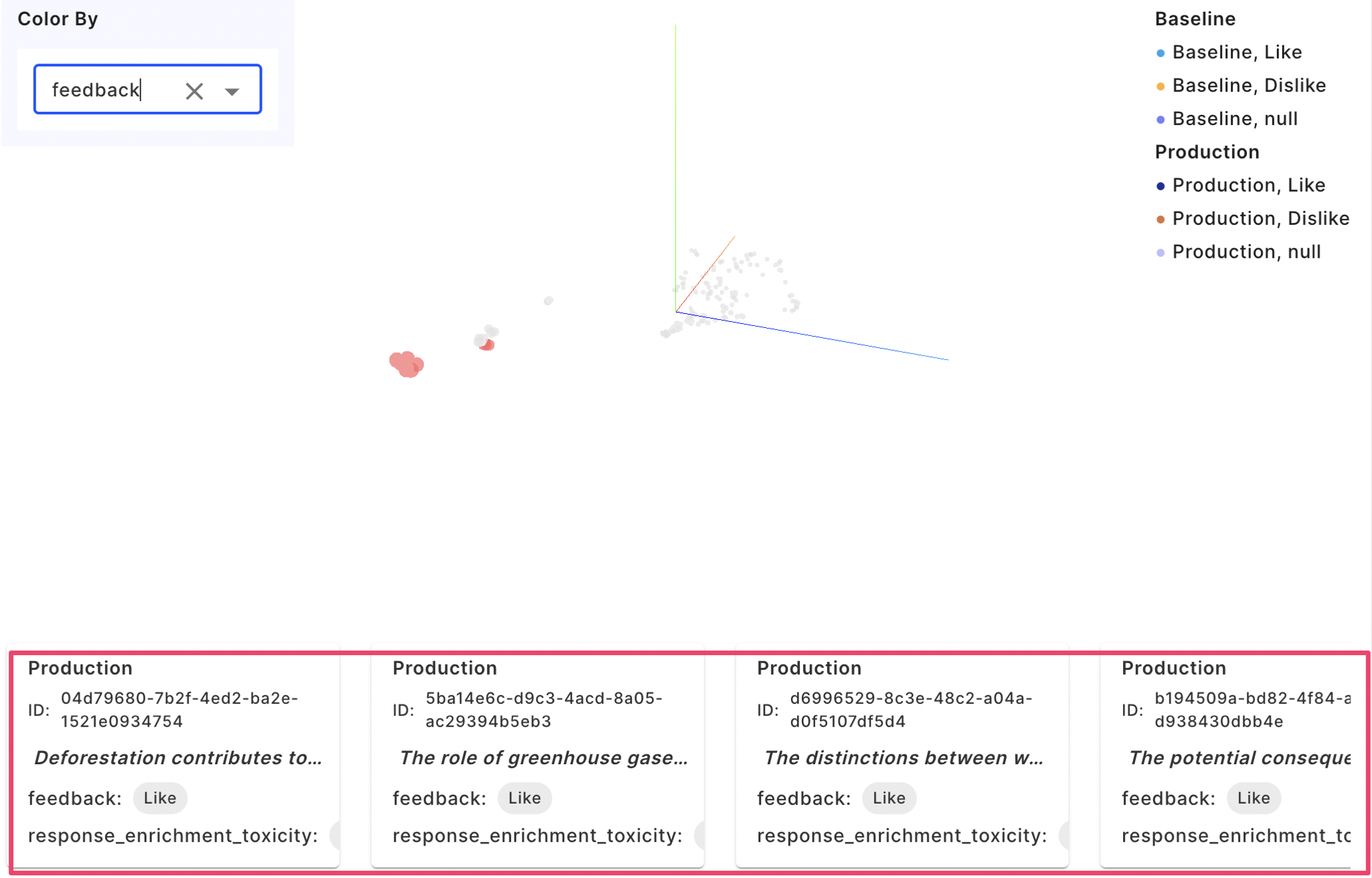
Selection of Data Points
You can select individual or groups of data points to analyze further.
- Click on a data point to select it. or use the Selector on the top right to select multiple points
Data cards
- Selected points will be highlighted on the chart and details of the display columns of these cards are displayed in data cards as shown below
- Use this feature to identify and analyze specific data points
In the following example, we use the categorical attribute feedback, which contains three possible values: Like, Dislike, or Null, as indicated in the legend. After applying the 'color by' feature, the user selects specific data points to examine in greater detail. The selected data points are then presented as data cards below.
Hover on a Data Point
Hovering over a data point reveals additional information about it, providing immediate insight without the need for selection.
- Move the cursor over a data point on the chart.
- A tooltip will appear, displaying the data associated with that point, such as values of different display columns
- Use this feature for a quick look-up of data without altering your current selection on the chart.
Saving the Chart
Once you're satisfied with your visualization, you can save the chart. This chart can then be added to a Dashboard. This allows you to revisit the UMAP visualization at any time easily either directly going to the Chart or to the dashboard
↪ Questions? Join our community Slack to talk to a product expert
Updated 5 months ago